Issue 1
Data Dumped
When I heard Mark Hanson and Ben Rubin’s talk at the Eyeo Festival in which they discussed the methods and representations of text analysis, I was drawn to it. Immediately after, I thought, “What body of text means the most to me at this point in my life?”
A Bit of Back Story
For the previous four years, I had been in a long-distance relationship. In this kind of relationship, texting was not just a form of communication, it was more or less the relationship itself. It wasn’t easy to withstand the curse of distance for that long, but my boyfriend and I had always insisted we could hold on to each other until the end. Four years was long enough to get into the habit of thinking this was how things would be. It ended rather abruptly the summer of 2016, and I found it hard to believe, as do most people who go through a breakup. Timely enough, a quote by Annette Messager came to me: “Being an artist means forever healing your own wounds and at the same time endlessly exposing them.”
It was clear that I had to live in the concrete markers of this experience—my own data—to try to make the most out of it. So I decided to make a graphic representation of the text analysis from of all the text messages that I had shared with my ex. Like Beyoncé’s empowering album that summer that had responded to her husband’s cheating, this was my Lemonade. I chose texture as my representation because I thought the abstraction of text into visual patterns might expose the hidden meanings between words.
The Process
I started by gathering all the archives of the conversations that I still had. Turned out, I could only access the first four months and the last four months of our four-year relationship (I changed my phone twice during our courtship). Call it serendipity. I ended up with a collection of CSV files, and it was definitely odd to see all the emotions I had felt on the driest of all mediums : the spreadsheet.
I dove head first into analysis and managed to make some sense out of more than 300 thousand lines of messages and buried memories. Then, to visually represent these messages I used Rune.js, a library that allowed me to draw in Javascript and save the files as SVGs so I could print them later.
When I first thought of doing this project, I knew I would have to face things that I had been avoiding. But when I was actually immersed in the data set, that feeling was exponentially intensified as I began to look for clues of where it all went wrong. It became the logical counterpart to an emotional situation, and I ended up pulling three different conclusions from the data set.
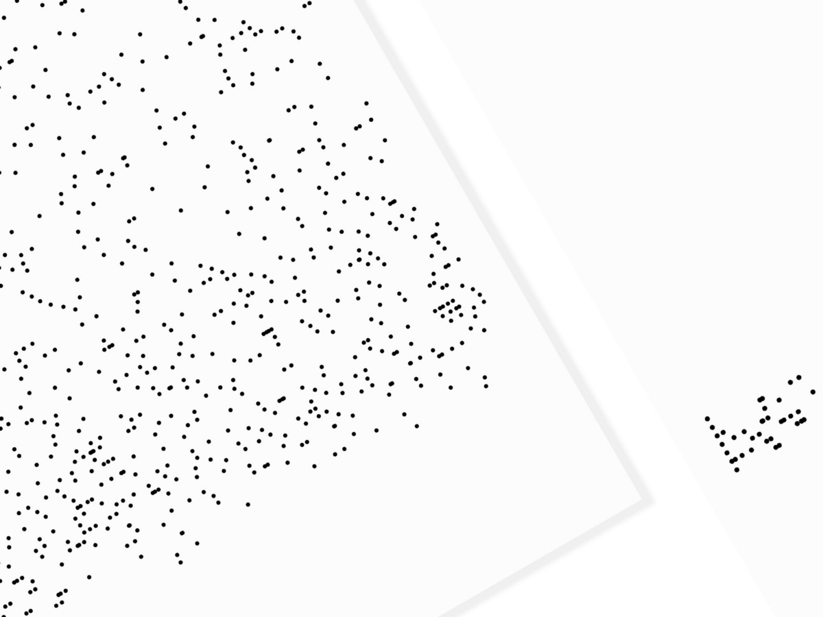
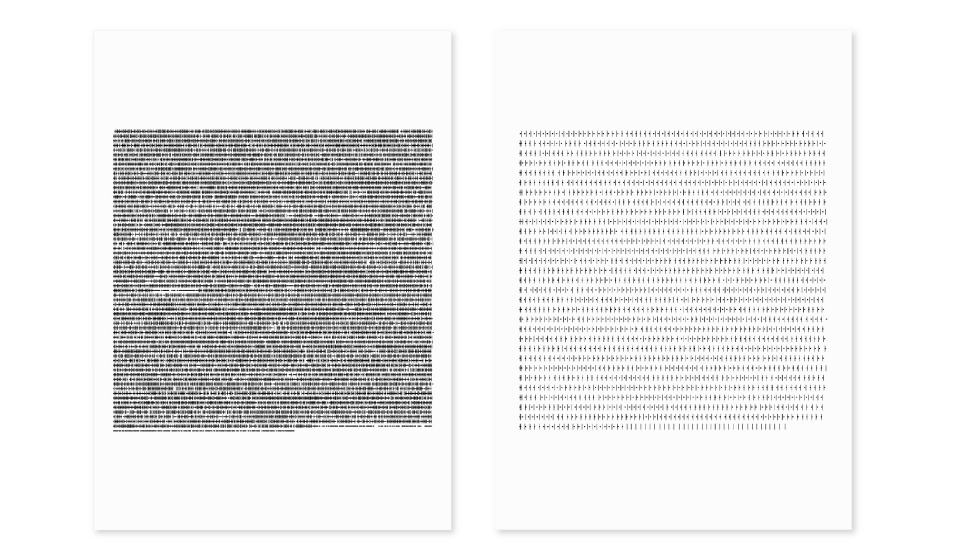
1. Say My Name
The first obvious clue in the body of text lay in my name. To represent this, I programmed my code to draw an ellipse every time he said (or in this case, texted) my name. Over the course of our relationship, we developed our own names for each other, so the red dots represent when he called me by my actual name (you know, serious stuff like breaking up), and the rest were our silly names.
It was funny, I had thought something was wrong with my code when I saw the last four months’ result—practically empty—but that was actually how much we talked. Towards the end it was purely just my name, five times in a row, a drastic shift from intimate to distant bond. Silly of me to think that everything was the same.
[ Say my name ] Left: first 4 months | Right: last 4 months
2. Needy One
Next, I decided to explore the dynamic between us. I checked the frequency of who texted whom and drew an ellipse every time he said something and a line every time I said something. It was a way to see who was the more needy, or more eager for connection.
[ Needy One ] Left: first 4 months | Right: last 4 months

I saw that the dynamic shifted. Very active in the beginning, my ex slowly needed less and less of my virtual presence and I became more and more dependent. Notice the sequence of lines toward the end of the last four months? That was me baffled, without an explanation from the other side.
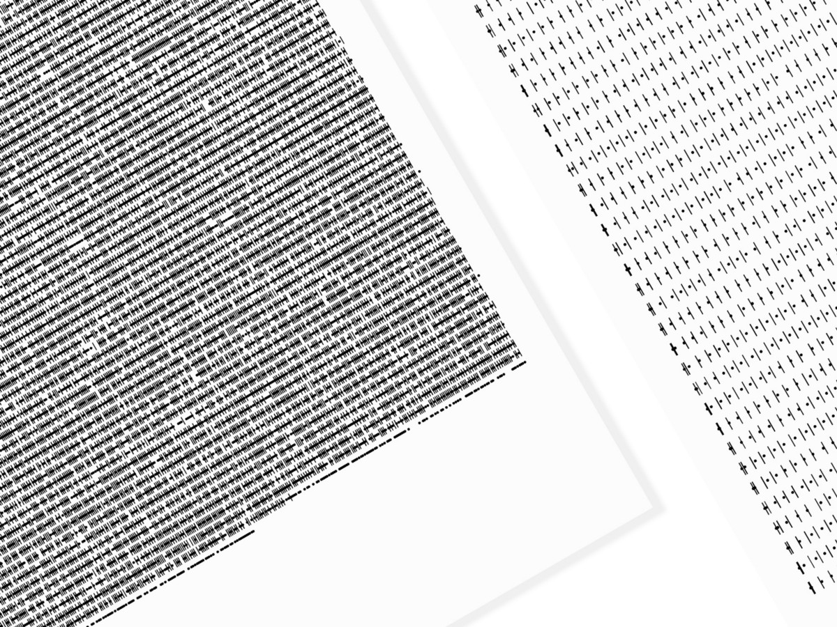
3. Rambles
Lastly, I decided to do a word count to see if I could test the quality of our conversations. I drew vertical lines whose height reflected the number of words sent—black lines for his messages and grey lines for mine.
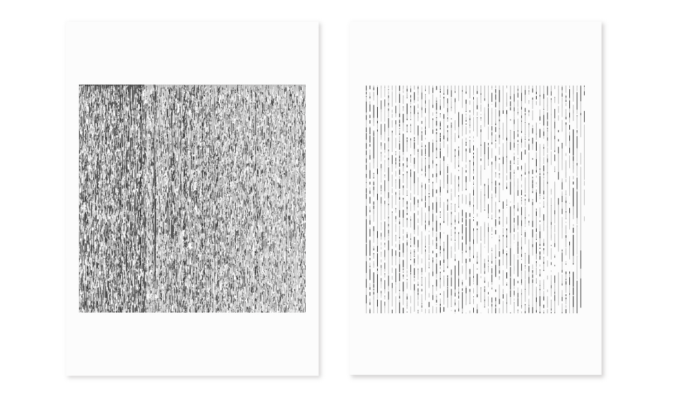
[ Rambles ] Left: first 4 months | Right: last 4 months
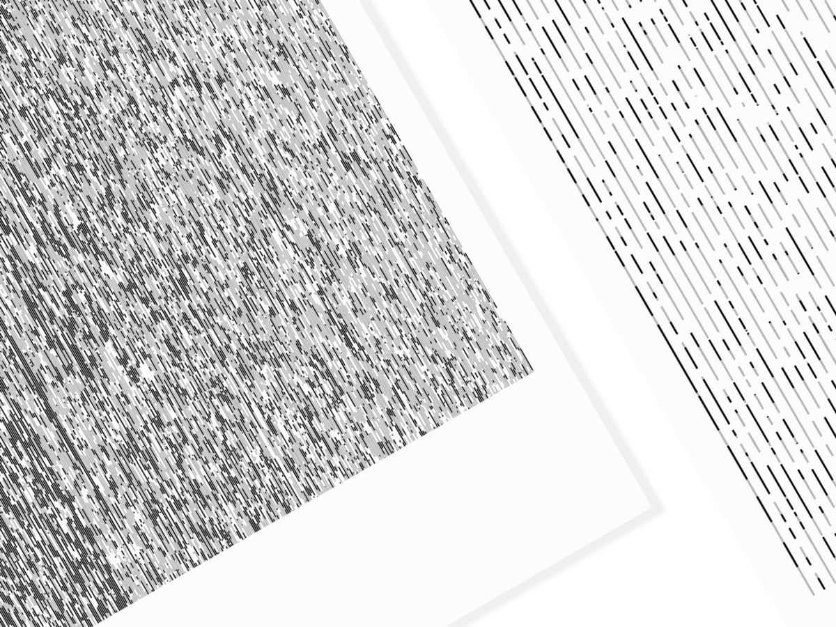
This exercise was the most unexpected for me; I was on a quest to find quality but what I found was the drastic change in quantity. As you can see, we used to text each other all the time in the first four months, hence the complex texture compared to the emptier and not-so-complicated texture from the last four months. Simple, in this case, does not necessarily equal beautiful.
Conclusion
I had never felt more naked than when I presented this in my Data Art class, taught by Jer Thorp. I had never felt so personally invested in anything I’d ever created before. By doing this project, I not only deciphered the unraveling of my relationship by reading between the lines, but also developed what I call “4/4 vision”: a clearer eye that sees the true dynamic of my relationship by comparing the start and the end. Revealing an uncanny, inescapable truth, the project showed me all the things I didn’t see… or didn’t want to see.
Note: A version of this essay first appeared on Medium.