Issue 11: Sweat
How The Worldwide Web Became an Obstacle Course

INTRO
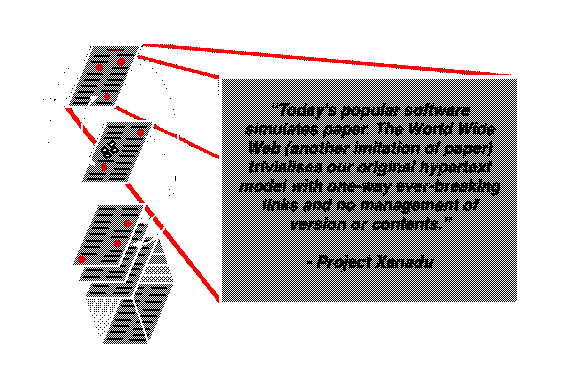
It’s 1960, and the landscape of computing, let alone personal computing, is nascent. The transistor is being introduced, data is still stored and read on tape, and the venerable quicksort algorithm is just invented1. The way humans interact with computers is ripe for speculation by imaginative thinkers and dreamers. One of these thinkers and dreamers is inventor Ted Nelson, who in 1960 was an undergraduate student at Harvard University. Apparently running out of things to do at the prestigious institution, Nelson begins thinking about how to leverage the future, unknown power of computing to develop an ambitious blueprint for a “digital repository scheme for world-wide electronic publishing” – an instantly accessible, universal storage system of everything anyone has ever written, connected to each other. Naming it “Project Xanadu”, he imagines this as a solution to publishing, education, citation, accuracy, copyright, misunderstanding, and in turn he claims, world conflict – all in a system that connects everything ever written. Though the project never came to fruition, one very game-changing concept came out of it – Nelson’s coining of “hypertext”, to describe the linking of different documents for immediate, on demand access. Though the project was idealistic, and one of computing’s most legendary examples of vaporware (Nelson spent decades building it and though some versions came from it, the original vision never materialized) the hypertext concept remained strong in the development of networking in the late 20th century and found itself coming to life with the invention of the World Wide Web. Nelson himself noticed as much, saying, “What I thought would be called Xanadu is called the World Wide Web and works differently, but has the same penetration”2 .

XANADU
What were its motives? In his expressive DIY, zine-like publication Dream Machines, Nelson claimed that testing, grades, and teachers are evil, and discourage true learning by introducing power dynamics and inequality. He saw the embryonic field of Computer Assisted Learning as heading in that same direction, but also noted the potential of computers freeing us from the middlemen of teachers, and the adversarial nature of test-based, ranked education3. Hypertext could make learning more autonomous and engaging, with the interlinking of documents and media referencing each other providing a new model of recursive self-teaching.
Though Xanadu was an idealistic model and a far cry from today’s materialized, inevitably more fragmented web, in many ways the project felt like a more logical progression of the static document model that came before it and defined human recordkeeping for centuries before than what we ended up with today. Even though Xanadu’s framework may not have worked as a content consumption platform which defines so much of today’s web, it provided a glimmer of hope for the future of collective knowledge sharing.
TODAY
Flash forward to today, the term “hypertext” has become embedded into the acronyms HTTP, the hypertext transfer protocol and HTML, hypertext markup language, which work together to form the circulatory and skeletal systems of the web. Though the term is so integrated into our digital jargon and now seemingly self-explanatory, “hypertext”, in its Xanadu context, originally described a sort of monolithic digital filing system which, using the power of storage and networking, could perfect the accumulation of human knowledge production, serving as the evolutionary next step for human recordkeeping.
Though we see figments of this vision brought to life in isolated examples like Wikipedia, and maybe internet forums, today’s “hyper” internet has strayed far from its namesake circulatory and skeletal systems. Looking at the internet today, the universal filing cabinet model has not been fulfilled, and a more accurate metaphor to describe its structure and experience may be artist Nam June Paik’s “electronic superhighway”, first coined in 19744. Though Paik probably meant the term as an invigorating, mostly optimistic vision of instant telecommunications, a perspective apparent in his 1997 artwork of the same name, the metaphor as materialized in the modern web has also preserved the superhighway’s most unglamorous features… paywalls are toll booths, the infinite scrolling feeds of our social media apps are the seemingly never-ending thousands of miles of roadways, and the billboard ads are, well, billboard ads. Like their IRL highway counterparts, these are all elements which generate sprawl and friction in the webspace, and ask users for their unwilling cooperation to provide labor, money, or attention as part of a revenue model.
the process, I ask who are such advances for, encourage us to alter our perceptions of tech advancements as inevitable, and urge the imagining of a better, less convoluted and obstacle ridden future for the way we interact with our devices.
Personal computing is arguably reaching its limits in pure usefulness – computers can store and sift through hundreds of documents or other media open at once, displays have become so sharp that pixels are indiscernible to human eyes, and touch screens allow direct interaction with content in a way that feels like a pure extension of the human body. It is reaching its limits to the point that technological advancements today rely mainly on offering grandiose, larger than life promises, accompanied by slick advertising campaigns, whose novelty often overshadows the actual use value of the products themselves. In the age of Apple Vision Pro and OpenAI, the merging of man and machine is reaching uncanny levels, but the spectacle and hype overshadow the relatively boring but massive achievements of widespread internet connectivity and affordable computing devices around the world. As a consequence, personal computing is becoming less intentional, and being shaped around “content consumption”; advancements are most noticeably being used to throw more garbage at your eyes to sift through, and more garbage for your fingers to scroll past. As hardware evolves, day to day software is evolving with it not for consumers, but for corporations which stand to benefit most from it.
It’s why Google has solidified itself as a main access point to the web with its Chrome web browser, and is leveraging that to weaken ad blocking on the user side, by changing how extensions work in its browser, mainly to target ad blockers and their methods5. Past such blatant efforts, however, the creation of synthetic barriers to hinder seamless access digs itself into every fiber of the web, and thinking about the alternative, simple yet utopian futures imagined by projects like Xanadu makes one notice the micro-nightmares haunting every crevice of the webspace, and taking away our autonomy as “Users”.
REAL ESTATE
In the early days of hypertext, the profitability potential of the world wide web was questioned by big companies, even as personal computing and software itself was booming like never before. There was a major contradiction which separated the web from centralized, regulated, and consolidated platforms like television and radio before it – access was baked in, and unlike restricted usage of closed computer systems before, and the increased prevalence of paywalls later, the Wild Wild West of the early web did not have any standard practices or strategies to monetize.
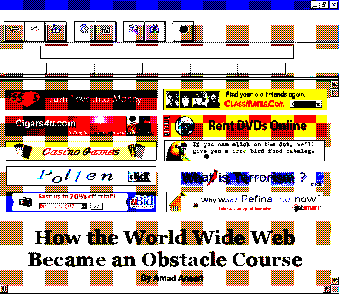
As print media started going digital, an attempt was made to bring past monetization efforts to the web, through display advertisements. With limited bandwidth and pixels to play with, these ads were at glance obnoxious, but temporally unobstructive, wide and short banners. Banner Depot 2000, an early banner ad archival project by Yufeng Zhao and Richard Lewei Huang collects these ads, and highlights their visual characteristics – colorful and flashy, but juvenile and ultimately minimally intrusive on the screen. These ads would be found on digital conversions of long standing beloved gossip sections like Page Six – whose layouts were structured with display ads as an afterthought, rather than a central component.
Though this example is defined by the simplicity and innocence of the juvenile web, online advertising soon eclipsed its ancestors in print media and television to become unprecedentedly complex and intentionally opaque, in its behind-the-scenes technical operation and targeting data and metrics collection, the networks and relationships between publishers, advertisers, and middleman ad tech companies, and the standards which define ad slots and formats (mediated by the International Advertising Bureau).
Opening Page Six now, the culmination of these developments become apparent right as the page loads. On a screen that may have 4-8 times as many pixels as one that would be used to view Page Six in 2001, a user is immediately bombarded with literal highway billboards. Thanks to wider rather than taller aspect ratios, hidden menus, and a desire to show off how big and sharp fonts can look, opening a page on your laptop may greet you with no useful information on first load at all, forcing you to scroll to read more than a single headline.
Even though the web browser exists on a computer you already purchased, and may use in the privacy of your home, the pixels of its display have become micro-real estate to be temporarily but regularly leased to external actors. In 2009, programmer and Free Software activist Richard Stallman wrote fervently against what he called in “The JavaScript Trap”, a term he uses to describe websites executing obfuscated code on one’s web browser without immediate permission6. Though display ads deploying code on your machine to display some elaborate animations or interactivity, or collect data to help track ads, are not immediately harmful, the mechanism of attack is not far off from that used by malicious hackers, and makes one wonder about the silent contracts and artificial sacrifices users agree to simply read their daily celebrity gossip news.
HAMSTER WHEEL
Though the Online Advertising Real Estate Business has been around for a while, it became deadly and highly profitable when combined with another user interface “innovation” gaining prevalence around the 2010s – infinite scroll. First designed by engineer Aza Raskin in 2006, infinite scroll promised a new way of interacting with content for the better, providing an alternative to the existing process of pagination – the distinct separation and linking of pages which was more in line with the hypertext model of Xanadu and the early web7. Words like “fluid” and “seamless” became mainstays in the lexicon of UI/UX designers, and the proliferation of increasingly precise glass touch screens and multi-touch trackpads on our computing devices made scrolling irresistible. So irresistible that infinite scroll has become a focal point of critiques on addiction to social media and smartphones – even Raskin has been quoted as saying he feels guilty about his invention leading people to addiction8.
The well lubricated hamster wheel of an infinite feed became the perfect online advertisement delivery vehicle, and there was greater incentive to get users hooked on less intentional consumption all day to extract their attention and sell it to advertisers (remember that merely ten years before the iPhone was invented, the internet was still connected through a phone line in most households, and its scarcity demanded intentional and unwasteful usage). Though infinite scroll seems like an inevitable evolution of human-computer interaction given its prevalence today, Raskin himself points out that infinite scrolling tied into social media, and app startups directly correlated increased time spent on their apps to increases in stock prices9.
Additionally, new research on infinite scroll and other so-called dark patterns which turn users into zombies while making them feel bad about it, suggests that alternative interaction models could exist, proving the careful nefariousness of the Product Managers and UI designers who manufacture the grounds of such time wasting behaviors. In a study published by the ACM, researchers created and tested what they named “nudging” tools to combat addictiveness, including a browser extension aptly named inControl, which gradually darkens the background of one’s Youtube or Facebook feed to make content less appealing and accessible, and intuitively makes clear the amount of time spent on unintentional scrolling behavior10. The study found that inControl promoted intentional use and decreased passive scrolling. The solution to the doom scrolling epidemic could be this simple, if tools like inControl were adopted by app creators and social media websites. However, such tools would free users from the shackles of an attention driven revenue model, and their lack of prevalence makes clear that companies have no genuine interest in providing the best possible experience to its end users and their digital wellbeing.

LABOR
As much as we may like to think internet surfers are only humans, many of them are bots, lurking among us, roaming the expanses of the internet to collect data, perform repetitive operations, or distribute spam. Bots have proven troublesome for large web maintainers, disrupting and taking advantage of the (not so) free services they run. An early and still widely used obstacle to distinguish between bots and humans is the CAPTCHA, or “Completely Automated Public Turing test to tell Computers and Humans Apart”. For most of its history since being commercially used from the early 2000s, the Captcha has consisted of warped images of text meant to be easily decipherable to humans, but (ideally) not decipherable by computers. The idea was simple enough and worked well for a while. However, as they do, hackers leveraged improvements in machine learning and computer vision to circumvent these measures. Thus developed a cat and mouse game to make Captchas increasingly complicated for computers (and in turn users).
Somewhere along the way, Google and others realized that Captchas are a great way to kill two birds one stone: as well as helping with human screening, they can help with the important task of optical character recognition training and text digitization. Perhaps most successfully, Captcha was used to covertly enlist humans to digitize NYTimes scans and books11. However, as these things go, Google has gotten carried away in the past few years. Recent Captchas have become image based, and instead of accomplishing a global good like text digitization, these puzzles are being used to train AI identification for self-driving cars and generative image models. As they increase in complexity for computers and humans alike, they become more unpredictable, frustrating, and laborious. A look on the subreddit r/Captcha shows humorous and bizarre examples of this:
These increasingly mind boggling puzzles become entangled with basic internet services like email (Google’s own gmail is the largest email provider in the world). Though it can be described as a necessary obstacle to combat bad actors on the webspace for the good of all, the irony is that Google has its own aptly named Googlebot with which it is guilty of scraping and crawling the web to “improve” its own search services and indexing12. Here we see the webspace become a puzzling testing ground for users locked into services which they rely on, and bring to mind the widely used adage – “if something is free, you are the product.”
As we have
As hypertext promised:
Artificial Intelligence and Augmented or Virtual Reality are promising to be the next frontiers of personal computing, the next evolution
With grand philosophies in their marketing, which almost threatens to leave those unwilling to evolve with them behind in the dust
If the past and present is any indicator, infinite scroll, UI changes,
Once again caught in an Ouroburos-like cycle
With these explorations of some elements of the Electronic Superhighway I implore us to ask – though improvements in day-to-day consumption tech we interact with may look flashy and slick, how many of these improvements are actually liberating, and how many of these improvements are distracting, and in turn imprisoning? When do we use computers to accomplish our goals, and when do corporations use computers to have us accomplish their goals, through the covert extraction of attention and labor? An early promise of the personal computer was to alleviate friction, to disrupt and distract our minds less in order to accomplish more. The world wide web today is a far cry from the promises of Xanadu, and the wild wild west is now mostly ridden with glue traps.
Works Cited
- “Timeline of Computer History”, Computer History Museum, https://www.computerhistory.org/timeline/1961/ ↩︎
- Belinda Barnet, “Hypertext before the Web – or, What the Web Could Have Been”, The SAGE handbook of Web History (2019): 220. ↩︎
- Ted Nelson, Computer Lib: You can and must understand computers now / Dream Machines: New freedoms through computer screens—a minority report (1974), Microsoft Press, revised edition 1987 https://worrydream.com/refs/Nelson_T_1974_-_Computer_Lib,_Dream_Machines.pdf ↩︎
- “The future according to Nam June Paik,” Tate. https://www.tate.org.uk/art/artists/nam-june-paik-6380/the-future-according-to-nam-june-paik ↩︎
- Amadeo, Ron, “Google Chrome will limit ad blockers starting June 2024,” Ars Technica, 21 November 2023. https://arstechnica.com/gadgets/2023/11/google-chrome-will-limit-ad-blockers-starting-june-2024/ ↩︎
- Stallman, Richard, “The JavaScript Trap,” GNU Project, 24 March 2009. https://www.gnu.org/philosophy/javascript-trap.en.html ↩︎
- Hilary Andersson, “Social media apps are ‘deliberately’ addictive to users,” BBC, 3 July 2018. https://www.bbc.com/news/technology-44640959 ↩︎
- ibid. ↩︎
- ibid. ↩︎
- Alberto Monge Roffarello and Luigi De Russis, “Nudging Users or Redesigning Interfaces? Evaluating Novel Strategies for Digital Wellbeing Through inControl”, Proceedings of the 2024 International Conference on Advanced Visual Interfaces, ACM, September 2023. https://dl.acm.org/doi/pdf/10.1145/3582515.3609523 ↩︎
- Gugliotta, Guy. “Deciphering Old Texts, One Woozy, Curvy Word at a Time,” The New York Times, 28 March 2011. https://www.nytimes.com/2011/03/29/science/29recaptcha.html
↩︎ - “Googlebot,” Google Search Central. https://developers.google.com/search/docs/crawling-indexing/googlebot ↩︎
