Issue 2
Crowdsourced Data and the Fight Against Florida’s Sea Level Rise
I grew up in Venice, a sleepy beach town on the West Coast of Florida. I moved up north after earning a BS in Journalism from the University of Florida and lived in New York City and Philadelphia for more than 20 years. By fall 2013, I was back in the Sunshine State and noticed that my parking lot kept getting flooded, with the rising waters posing a threat to my car. Was I sleeping through giant rainstorms, I wondered? No. “It may be related to sea level rise,” the locals told me. Despite having been raised in Florida, I had never heard of sea level rise.
For a solid understanding of what was going on around me, I had to look no further than the work of two of my new colleagues at Florida International University (FIU), Prof. Kate MacMillin and Dr. Juliet Pinto, whose award-winning documentary, South Florida’s Rising Seas, reveals how the region is slowly being inundated by the ocean tides, which are rising due to polar ice melt and increased temperatures. According to recent estimates1, the world’s oceans could rise between two to six feet by the end of this century. South Florida gets a preview of this calamity every year during the King Tides—the highest high tides of the year, when the water levels can rise over three feet and flood low-lying neighborhoods.

Ground Zero of Climate Change
Miami has been called America’s “ground zero” of climate change, due to having both the largest area and the largest population at risk from rising seas2. South Florida is particularly vulnerable to sea level rise due to its low elevation and the nature of its geology. Most of Miami-Dade County is less than six feet above sea level, and unlike Manhattan or the Netherlands—both of which rest upon solid bedrock—South Florida sits on porous limestone. When the seas rise, the water may come up over the seawalls, but it is more likely to bubble up from the ground, particularly through the drainage system. If you walk through some neighborhoods in Miami Beach during the King Tides, you will see this phenomenon. The City of Miami Beach installed a 100 million dollar pump system to remove water from the streets when this happens, but the pumps simply push the water back out into the bay, leaky rowboat style, and have a 30- to 40–year expectation of usefulness3.

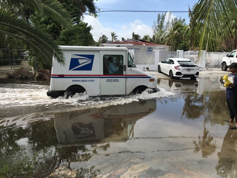
The evidence is depressingly clear that flooding is increasing in South Florida. Every few weeks we read of new predictions for higher—and quicker—levels of sea level rise.4 More rarely, we hear of potential solutions.5 The data shows that the massive plight facing South Florida may be postponed through temporary solutions like the pumps on Miami Beach—but the water will ultimately overtake us unless more permanent solutions are found. But how best do we go about creating this knowledge in a way that will help foster the creation of long term solutions?

Crowdsourcing Data: A Civic Approach
When dealing with environmental issues, there are many benefits to approaching the task of knowledge creation through community-engaged research. Research suggests that studies carried out in conjunction with local communities are more likely to achieve social acceptance, become policy relevant, and influence outcomes bearing favorable environmental impact.6 Wide-scale collection of citizen-generated data on the specifics of an issue—in this case flooding—may potentially provide more local detail than is currently available from institutions that serve much broader geographic regions, such as the National Oceanic and Atmospheric Administration (NOAA).
This paper details the development of this approach in South Florida, where my collaborators and I aim to create a model that can be replicated in other parts of the world—one that not only provides the public with information about the impact of sea level rise, but that also puts tools for the collection of such data directly into the hands of citizens. A grassroots project that has the ability to circumvent political hurdles of funding and researching the politically fraught topic of sea level rise at the institutional level.

A First Step: The Sea Level Rise Toolbox
Sea Level Rise Toolbox, available at http://eyesontherise.org/app
In 2014, my colleagues and I won a challenge grant from the Online News Association with a project called Eyes on the Rise. As part of this grant, I served as project lead on the Sea Level Rise Toolbox, an interactive viewer that lets users enter an address to see the potential impact of sea level rise of up to six feet on their homes and businesses. It’s quite an eye-opening experience for residents of South Florida to see that their homes may be vulnerable to sea level rise7.

The visualization was developed by Dan Mcgillicuddy at FIU’s GIS Center, led by Jennifer Fu, and was based in part on the work of Pete Harlem, a longtime GIS staff member at FIU and a legend in the climate change community who passed away in 2016. In developing the visualization, we chose to show the impact in feet rather than over time, because there are multiple predictions about when sea-level rise will impact South Florida, and in 2014, this was still a politically sensitive topic.
Many students, local organizations and citizens contributed to this project. Code for Miami helped us conduct user testing and front-end implementation. The interactive team at Fusion, based in Miami, developed the tabbed interface, which is designed to be easy to use by a general news audience.
We launched the toolbox at BarCamp Miami 2015, and since then it has been covered by The New Yorker, CNN, Scientific American, The Weather Channel, The American Prospect, The Biscayne Times, and several local news organizations. Building on the project’s success, we sought to further develop our work of engaging with the South Florida public around the potential impacts of climate change.

Crowdsourcing
Turning our efforts on developing tools to involve the community in the data collection process, I started to develop a method to document sea level rise-related flooding around Miami-Dade County. Beginning in fall 2015, my colleagues and I sent teams of students out to map flooding during the King Tide periods using a simple online form. During this time, I also started collaborating with Tiffany Troxler, Director of FIU’s Sea Level Solutions Center, who, with her staff, assisted us in developing the quality and metrics of our crowdsourced measurements.
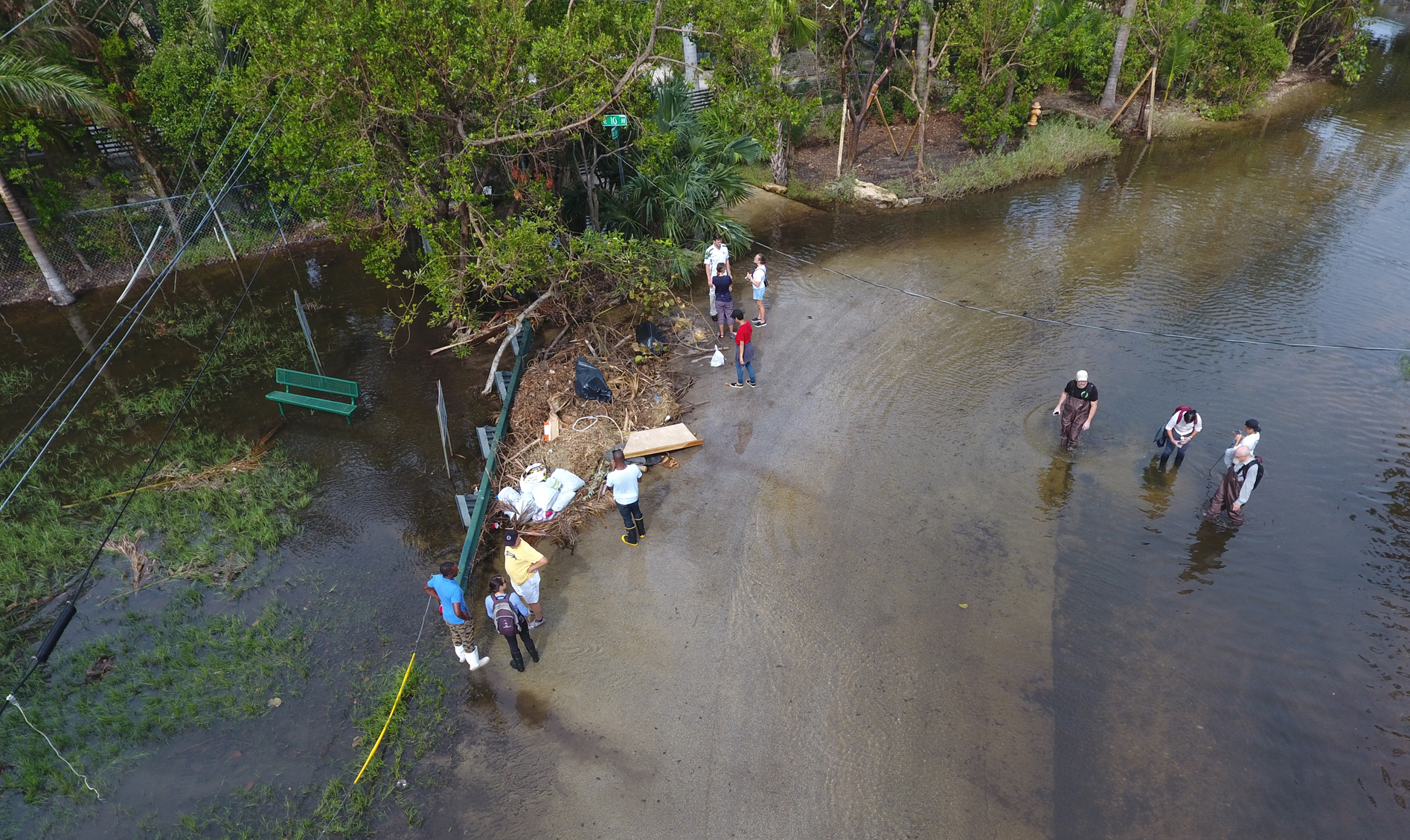
In 2016, we continued our crowdsourcing efforts, this time by organizing students and sending them to specific locations around Miami-Dade County that we knew were especially vulnerable to sea level rise. This culminated in the first Sea Level Solutions Day, sponsored by the Sea Level Solutions Center and the Journalism Department at FIU, at the Vizcaya Museum and Gardens. About 100 citizens gathered to document water depth and salinity and take photos of flooding. Working with the Sea Level Solutions Center, we started to standardize our data collection methods, asking participants to include images showing water depth measurement by photographing a yardstick in the flooded area and by taking a picture of the salinity reading in the refractometer.
’s tool My Maps was employed to quickly map the data received.
Hurricane Irma swept through the region in early September 2017, and we were unsure what impact the hurricane would have on the King Tides that were scheduled to begin two weeks later. Millions of Floridians were ordered to evacuate,8 but thankfully Miami was spared a direct hit. Later that month, we collaborated with a group that included Jan Booher of the ReACT Toolkit, Kurt Menke of Community Health Maps, and John C. Scott of the Center for Public Service Communication to document flooding in Shorecrest. This group showed us how to use Fulcrum to collect data in crowdsourcing projects.
Building on what we learned in 2016, we added specific buttons to upload photos of salinity readings; water depth measurements; photos showing the context of flooding, and closeup photos of flooding. Instead of mapping several areas around South Florida, we focused on the neighborhood of Shorecrest, where we asked participants to take three readings: an hour before the peak of the high tide, during the high tide peak, and an hour after the high tide. The three readings gave us a better sense of how quickly the water built up, how deep it was at the peak, and how quickly it dissipated. We repeated these efforts in Shorecrest during the King Tides in October.
In September, we found that water was visible on the streets of Shorecrest more than an hour before the peak of the high tide; reached its greatest depth around the time of the high tide (we recorded 12.2 inches as the maximum depth); and had noticeably dissipated an hour afterwards. (See the September map here.) Flooding in October was significantly worse, getting deeper at the peak of the high tide and taking longer to dissipate. This video, taken by Collin Simpson, shows what the streets were like. Cars passing through created wakes.
We hosted our second annual Sea Level Solutions Day in November, when the tides were predicted to be higher than in October. But flooding turned out to be much lower than anticipated, reminding us that the tide levels are not the only factors that influence climate-related flooding in South Florida. Groundwater levels, rainfall, elevation, drainage, water management systems, the Gulf Stream, and many other factors are also influences.9 The science of measuring climate change impact is not a straight line; climate scientists build complex models similar to used by meteorologists in order to anticipate future events and conditions.
Technology for Citizen Science
Over the past three years, we have learned a great deal about how to organize citizens to document the impact of King Tides in South Florida and the technology needed to support these efforts. As organizers, we have drawn first upon the university community. FIU is the sixth largest university in the US, and a majority of our students grew up in neighborhoods throughout South Florida. More than 300 of my students have participated in these events since fall 2015. Working with the Sea Level Solutions Center, we have collaborated with cultural and climate education organizations, civic organizations, and activist groups in South Florida—such as the CLEO Institute—as well as with local government officials, such as Jane Gilbert, the City of Miami’s Chief Resilience Officer, and members of the Miami-Dade County Office of Resilience.
From a technology perspective, the crowdsourced King Tide project relies on three applications:
- A method to help predict when the highest high tides will be present in different locations throughout South Florida
- A form that citizens may view on their phones that will send their contributions to a central database
- A mapping technology for visualizing the collected data
Each of these were implemented with the Sea Level Solutions Center and Code for Miami. One of our latest projects, the Will It Flood? app, lets Floridians enter their address into a Google Map interface and view, in calendar form, the dates of the highest high tides predicted for the tide-monitoring station closest to them. The high tides occur at slightly different dates and times in different locations, and although the presence of a King Tide does not guarantee that there will be flooding in the area, if you live in a neighborhood where flooding occurs during the high tides, this application will let you know when to expect them.
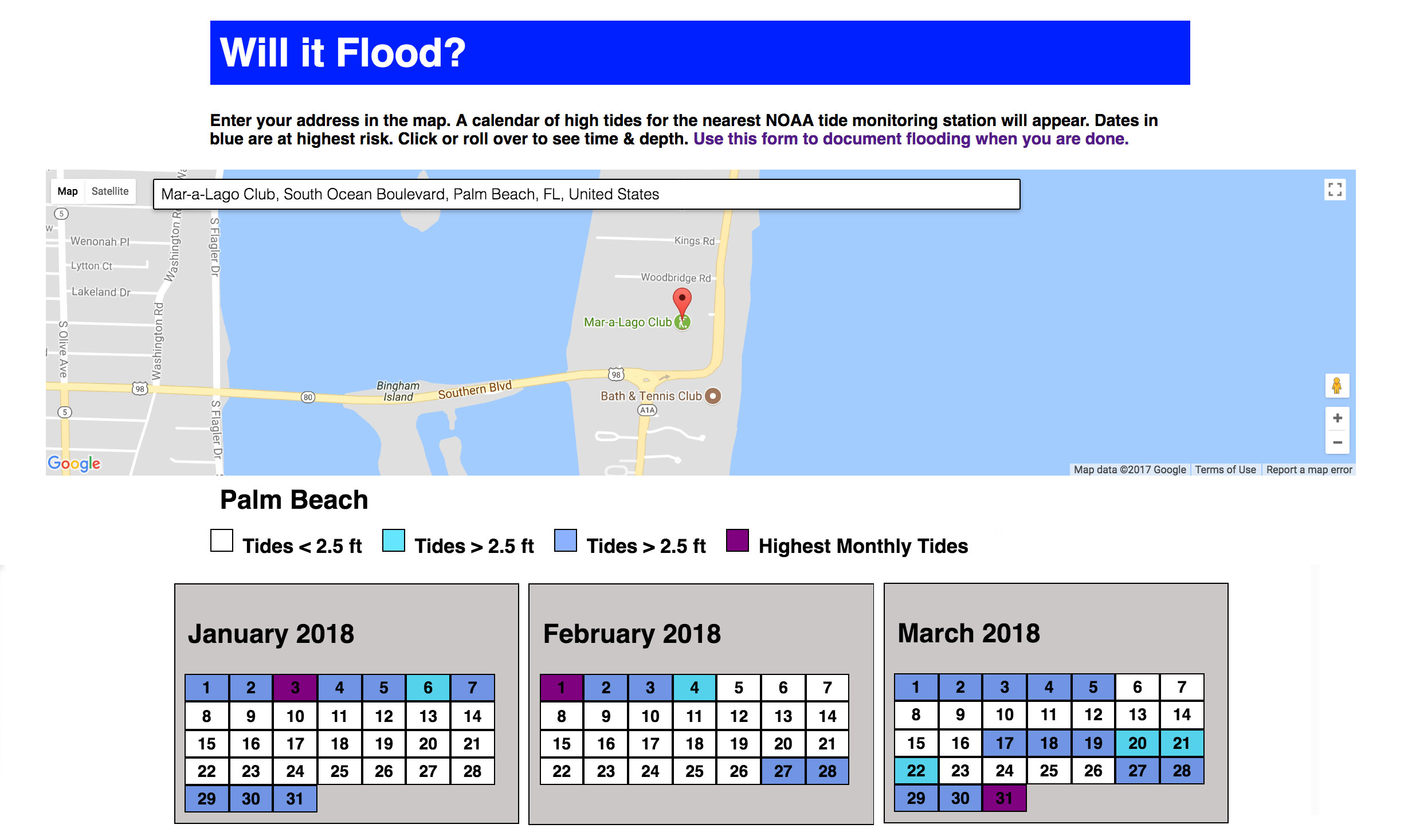
To create this application, we downloaded the 2017 and 2018 tide tables for the state of Florida from NOAA. The state of Florida has more than 500 tide monitoring stations. A handful of them record real-time data (for example, Virginia Key in Miami), but most of them use historical data to build estimates for high tide schedules. In our app, a user enters an address in the state of Florida, which matches their location with the nearest tide monitoring station using the haversine formula. A calendar of upcoming months appears, which is color-coded to show the highest high tides of the month and any high tides that are greater than 2.5 feet. The Code for Miami team then converted this project to a Ruby on Rails app and published the code on GitHub.

Next Steps
Moving forward, I will continue to work with the Sea Level Solutions Center to develop our citizen science crowdsourcing initiatives. Up to this point, we have focused on methods to document flooding, but there are many other ways that climate change impacts citizens today in South Florida, including increasing street temperatures, health effects, changes to the built environment, and transportation issues.
This spring, FIU will host a resiliency-themed hackathon in partnership with Code for Miami in its new Media Integration Lab. Some of this work will be featured at the CLIMA show on arts and the environment, curated by FIU Artist-in-Residence Xavier Cortada at the Pinecrest Gallery. Some of my advanced students are working on an interactive video engine to document South Floridians’ experiences with climate change. My colleagues Juliet Pinto and Kate MacMillan are working on a third documentary.
Code for Miami is continuing to develop the Will It Flood? app and an open-source flood form. We regularly invite speakers on sea level rise to talk to us, for example, Dr. Harold Wanless from the University of Miami, who was one of the first scientists to draw attention to the problem of sea level rise in South Florida.
We also plan to revisit the Sea Level Rise Toolbox to make it more responsive and to include more advanced predictive algorithms. Developing the algorithms is expensive because it requires highly specialized knowledge to create accurate climate models (think PhDs in Earth and computer sciences) and to collect and process large, heterogeneous data sets like groundwater data.

Some Specifics
The following section details technical tools and measurement metrics employed in the projects discussed here. As previously mentioned, the hope is to create a model that can be used by others working on sea level rise issues—and perhaps other environmental topics. (All work produced with Code for Miami is available on GitHub.)
Collecting Crowdsourced Data
There are a few web- and phone–based applications that allow people to create forms for crowdsourced applications. These applications consist of:
- A form-creation tool that lets users add the required fields to their form
- A method for making the form available to users on their phones
- A central database where the form data is collected
We tried out several different form tools and have used two. First, JotForm, a freemium form service that lets users design their own form, but limits the number of form users at the free service level. One of the strengths of JotForm is that it includes a GPS location service that will record the location where the data is entered. JotForm forms are also fully responsive and easily accessible from a mobile Web browser. The problems that we had with JotForm were two-fold: first, that it limited the number of users and views that were available at the free level (a number that we blew through on a couple of occasions when news media linked to the Sea Level Rise Toolbox application), and second, that anyone can use a JotForm, which makes it more accessible to the general public, but increases the number of random submissions, which decreases the reliability of the data.
We also used Fulcrum, a pay-for tool that turns a custom form into a downloadable mobile app. Users must register their projects to use the form, which aids in data verification (you know the source of the data), but we found that it was a barrier for many citizens in Miami who either did not want to download another app on their phone or were not able to access the app properly once it was downloaded. Furthermore, once we collected the data, the photos and videos uploaded as part of the data collection were stored on the Fulcrum website, and were only viewable by logged-in users. When we embedded the data we collected on a Google map, non-Fulcrum users could not see the images until we harvested the photos and videos individually, stored them on a publicly accessible server, and linked the new file names to the records—a process that took many hours, even with the limited number of records we collected.
To address these issues, Code for Miami is working on an open-source form specifically for collecting data on King Tide Flooding. Developing a system from scratch is complex. While creating the form is a relatively easy process, creating the back-end for collecting the incoming data and making it available in spreadsheet-friendly format is not so easy. We have two goals: first, to create a fully functional form plus administrative back-end that any group in any location may use to document flooding, in which the data would be sent to Code for Miami and but still made public; and second, to make the entire code available on GitHub so other developers may modify it to create their own form-plus-backend system. We have members with very strong technical skills in Code for Miami, but we are a volunteer organization, so it takes time to complete one of our projects. You can see our Flood Form code so far on GitHub, where we are building it out as a Ruby on Rails app.
Designing Data Collection for Citizen Science
A video produced by the Sea Level Solutions Center shows how to use the Fulcrum app for collecting citizen data.
As a journalism professor, I was most interested in how citizens might visually document the actuality of sea level rise and climate change impacts. In our first prototypes of sea level rise documentation forms, my colleagues and I emphasized date, time, location, and photographic elements of flooding. Once we collaborated with the scientists in the Sea Level Solutions Center, we learned we could ask citizens to take more precise measurements that could be potentially helpful to scientists, city planners, and community organizers, and would also lend more credibility to the data we collected.
One of the most challenging aspects of collecting crowdsourced data is data verification.10 To address this, we built several verification steps into our most recent form. We asked citizens to use a yardstick to measure water depth, enter the number in inches, then take a photo of the yardstick so that we could read, and verify, the data. We are still evaluating the outcome of our new data verification system, but initial results suggest that most citizen scientists can successfully follow the steps we require. We also asked citizens to use a refractometer to read the salinity of the water in the streets, record the measurement in parts per thousand in the form, and take a photo of the reading of the refractometer. A good photo is not easy to capture this way, and sometimes things go wrong. The Sea Level Solutions Center worked with FIU’s Miami Beach Urban Studios to create a 3D-printed device to hold the refractometer up to a cell phone to take better photos.

Right now, our form has the following elements:
- Name and Email: We ask for names and emails at events we organize in case we need clarification or follow up.
- Date of Report: The date, time, and location are important because they help create a model of when and where flooding occurs and for how long.
- Time of Report: King Tide flooding tends to start just before the time of the highest high tides, reach its peak about the time of the high tides, then dissipate. The duration varies, depending on a variety of factors, and recording the time of the reported flood helps us understand the length of flooding better.
- Location of Report: This feature uses the GPS on a smartphone to pinpoint location. Most smartphones are accurate to within a few feet, at least under optimal conditions, and more accurate GPS chips are coming out next year. There are some other considerations for capturing correct GPS, such as making sure the participants file the report near where they take the measurements.
- Water depth: An accurate measurement of water depth helps determine where flooding is more pronounced and allows us to measure fluctuations over time.
- Water depth units: Most yardsticks have both inches and centimeters.
- Water depth photo: We ask participants to take a photo of the measuring stick in the water showing the water depth.
- Salinity measurement: The saltiness of the water can tell us to what extent salt water has intruded into local water management systems. Citizens use a hand-held refractometer to measure the saltiness in the water. The closer the number is to 30, the saltier the water (freshwater reads as 0).
- Salinity units: Salinity is measured in parts per thousand.
- Salinity photo: We ask participants to take a photo of the salinity reading by holding the eyepiece of the refractometer up to the camera of a smartphone.
- Water bottle number: Sometimes we collect water samples to test for coliform and e-coli. When we do this, we have to keep track of the bottles, and ask participants to enter the bottle number.
- Water bottle photo: A photo of the water bottle so that we can be sure to associate the correct bottle with the correct location.
- Closeup photo of flood: A closeup photo should show where the water seems to be coming from. Usually, this is a water system feature, like a drain or a sewer.
- Context photo of flood: The context photo is a longshot of the area where the flooding occurs—a street, a parking lot, an area near a school.
- Video of flood: We ask citizens to take very short videos, only if they are meaningful, because the transfer of video data from a smartphone to the JotForm or Fulcrum database is problematic and sometimes does not work. Video that shows the flow of water out of a drain, for example, is helpful.
- Description of flood: We ask participants to describe the location of the flood in words (like across the street from a fire station) that might not be obvious from the address, and any characteristics that might not be obvious from the photos.
- Field notes: Participants may add any notes or other information that would help us understand the data they collected.
Mapping the Data
Once we have collected all of the data, we look for ways to quickly and clearly communicate our findings. There are a few tools out there that create annotated maps from spreadsheets of data such as those generated by JotForm and Fulcrum, and each one has its strengths and weaknesses.
- ArcGIS: The leading commercial mapping tool is ArcGIS. It is to mapping what Photoshop is to image editing. It has a mind-boggling array of functions, modules for creating static maps for print, and online maps for sharing. It is very expensive, starting around $1500 for a standalone copy, or $800 per year for a subscription. Many organizations, like universities, have sitewide licenses. In addition to being expensive, its many features can lead to bloatware, and the online version can be very slow to use for creating maps and very slow to access for viewing maps.
- Google Maps: Google Maps is the king of free online map-making tools. There are two flavors of Google Maps: My Maps and Fusion Tables. I use My Maps because it is very easy to add a data layer to a basemap and share with others. It is less easy to customize the display of the data associated with each point on My Maps, but this function has improved over the past two years. Fusion Tables gives some additional control over the display of associated data in “cards,” but I found it less effective than My Maps.
- Other tools: There are many other tools, some commercial and some free, but none of them have been as easy to use as Google Maps or as comprehensive as ArcGIS. However, this is likely to change over time. Some of the other tools that have come highly recommended include: QGIS, a free, open-source mapmaking tool that is great for creating static maps on your computer, but is more difficult to create web maps to share and customize. CARTO, a commercial mapping system that includes a free trial you can test out. Leaflet.js, a Javascript library that layers on top of maps, letting users customize the display of data on maps. While this is a useful feature, it is a labor-intensive one when it comes to uniformly styling large amounts of data. MapBox, a freemium product that looks promising, but was not as quick and easy as Google Maps to get started with.
At the moment we are looking for ways to visualize data collected by citizens, particularly photos. We do not yet need the sophisticated geoprocessing features included in many mapping tools, which is probably why we have run into limitations. The best method moving forward will probably be some combination of Google Maps that allows greater customization of annotation displays using Javascript.