Issue 3
Memes, Merch, and the Media in the 2016 Election
In August of 2015, I began hoarding tweets. I was brainstorming a project for an upcoming residency that I had received at SPACES in Cleveland, OH (which happens to be my hometown), focusing on the then still nebulous and undefined Presidential election of 2016. I knew that I wanted the work to center around the importance of Ohio in the American electoral process, and because my work had lately focused on social media, language, and culture, the venue had requested that the project I worked on during my residency maintain some of those same themes. In addition, having announced his candidacy for the Republican nomination in June, Donald Trump had already started to make a name for himself with his Twitter trigger finger and his well-known reliance on social media to disseminate and gain support for his ideas, most notably his championship of the “birther” conspiracy surrounding Barack Obama’s US citizenship. And so, on August 6, 2015, a few hours before the first Republican debate of the 2016 election, I started running a script designed to collect as many tweets as I could that mentioned every single presidential candidate by name.
I could not have even begun to imagine what was to come next.
Social media became, far and away, the superstar of the 2016 election—in large part, of course, due to Trump’s reliance on Twitter as a means to communicate directly with his supporters, mostly eschewing traditional news conferences or press releases. This, naturally, had a profound effect on my installation. As time passed, and I saw the effect that Trump’s Twitter habit was having on political discourse both online and off, a project that started as an experiment in data collection evolved into an archival examination of public opinion, social media, and the visual language of political campaigns. I ended up collecting tweets throughout the course of the entire primary season, stopping my script only on July 12, 2016, when Bernie Sanders endorsed Hillary Clinton for the Democratic nomination. I then performed a variety of analyses on the data originating from or explicitly discussing Ohio, in order to evaluate the language for things such as word and phrase frequency, grammatical structure, and emotional sentiment. The results were used to create #Bellwether, an installation which borrowed from each campaign’s own design and aesthetic choices in order to subvert their meanings and convey what was actually being said about them on Twitter by voices in Ohio. The re-appropriated campaign materials were designed and manufactured by hand, and displayed in a chronological timeline on the walls of the gallery.
Over the course of the project, what began to interest me was the discrepancy between the information collected via traditional polling methodologies—a process refined over decades to be as objective and as calculated in its approach as possible—and social media, where millions of individual voices express their own opinions as freely as they wish, with little to no calculation or filter.
During and after the 2016 election, media outlets across the political spectrum dwelled on the idea that public opinion polls were disastrously wrong. This point of view is not new—writing about polling for the New Yorker back in 1948, E. B. White quipped that “although you can take a nation’s pulse, you can’t be sure that the nation hasn’t just run up a flight of stairs”1—but criticism of standard polling practices grew louder and more widespread after several significant missteps throughout the primary season, and especially after the majority of pollsters predicted that Democratic nominee Hillary Clinton would handily win the general election against Trump.2 With each of these lapses, the discussion surrounding the efficacy of traditional opinion polls grew more urgent, and social media, with its indelible digital archive of individual conversation and opinions, was often discussed by scholars, researchers, and technologists alike as a way to gauge “true” voter sentiment.
Technology companies have attempted to harness the growing enthusiasm for this kind of analysis; Twitter added its data to the conversation surrounding the 2012 Presidential election with their “Twitter Political Index,” or “Twindex,” claiming to offer a long-term view of public opinion that could potentially provide insight into things that traditional pollsters may have been missing.3 The results closely mirrored the findings of major polling outlets such as Gallup. Later, in the 2016 election cycle, Google and Twitter partnered with the Associated Press for a project called “Election Buzz,” to index frequencies of searches and mentions, translate those findings into numerical indicators of support for the candidates running, and present it all in a very traditional, time-based line graph.4
But simply quantifying how many people feel one way versus another may not be enough; to truly understand public opinion, we have to take into consideration the ways in which groups of individuals espousing similar and different viewpoints interact with others.5 In this day and age, when we have concrete, tangible evidence of these conversations and statements available to us publicly, looking at the content posted online by such populations seems like a natural step in the right direction. While the AP’s “Election Buzz” made progress towards this, it paid little attention to the context in which candidate names or issues were discussed. What, for example, was a user searching for specifically on Google? What exactly were they saying about the candidate on Twitter? Those logging a search for Trump’s “Muslim ban,” for example, may have extremely different contexts surrounding that phrase, depending on whether they were supporters or not. The Twindex, by contrast, attempted to acknowledge sentiment, but only insofar as to squeeze the data into models analogous to traditional polling mechanisms. Varied emotions, such as anxiety, fear, disgust, or joy, were not evaluated in their own right; what sentiment did exist was sorted into just two categories: approval and disapproval.6 In both of these cases, the emphasis is on numbers—the amount something was mentioned in a given period of time, or the percentages of the population that felt one way about a candidate versus another in a strict dichotomy of emotion.
All of this begs the question of why it is really necessary to solely use quantitative methods of evaluating public opinion in the first place. Can we claim that qualitative assessment might be an equally valid, if not more appropriate, gauge of how the public is really responding to candidates? Could we look at something else that could be considered equally important to the study of public opinion: the words themselves? When I first began work on #Bellwether in 2015, this was the primary question I was aiming to answer.
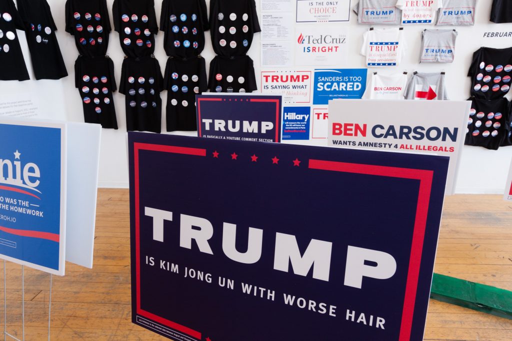
“Trump is Kim Jong Un with Worse Hair”
Although #Bellwether is not a perfect solution to these problems, it does offer an alternative perspective on what exactly social media’s role could be in the context of the historical and qualitative evaluation of presidential campaigns. By taking language crafted for social media and representing it in the context of a gallery exhibition, I wanted to lend greater weight to the actual words and sentiments posted than they might have been given in their everyday screen and timeline-based domain.
Over the course of the primary season, I ended up with close to 15 million usable tweets for the project. The next step was to analyze that content. After some experimenting, I settled on using regular expressions in order to sort the tweets by phrase frequency, based on a variety of different grammatical structures involving each candidate’s name. Combining phrase fragments such as “candidate’s name” and “is a [NOUN]”, “candidate’s name” and “should [VERB]”, or “candidate’s name” and “is not [ADJECTIVE]”, I combed through my entire database of tweets looking for language that matched these search terms. Whenever the program found tweets that were exactly the same, it kept track of how many times each specific phrase was found, and those numbers were eventually used to put those phrases in order from most to least popular.
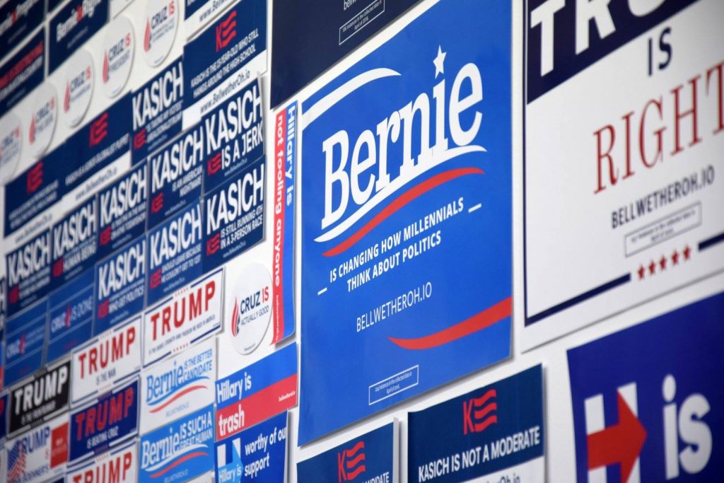
The final manifestation and representation of that data did not take shape until I visited the Cleveland City Club in the summer of 2015 as part of a research trip for the residency, and had the opportunity to view their political memorabilia collection. Comprised of hundreds of campaign buttons, ribbons, pamphlets, and more, the bulk of the material was donated to the organization in 1977 and stretches back to Andrew Jackson’s 1828 campaign.7 The sheer amount of items available to view and the length of time the collection covers is indicative of the fact that graphic design and campaign merchandise have been an integral part of United States political campaigns “…virtually from our nation’s inception”.8
In the modern era, the graphic identity adopted during a political campaign becomes part of the identity of the candidate, with colors, logos, typography, and slogans finding their way into every aspect of media or merchandise put out into the public.9 In the 2008 and 2012 presidential elections, this became even more of a focus due to Barack Obama’s universally acclaimed graphic identity, which departed from the haphazard logos and clunky typefaces traditionally adopted by politicians and instead presented a clean, unified look that clearly followed modern design principles and the styles used for advertising and corporate branding.10 Design has become so critical to a candidate’s image that when Hillary Clinton released her campaign logo in 2015, a slew of articles appeared picking apart its design, intentions, and purported meanings.11 The items carrying these graphic identities, such as buttons, bumper stickers, rally signs, yard signs, t-shirts, hats, and others, have become so intrinsically associated with the idea of the political campaign that many of the candidates running for President in 2016 sought to distinguish themselves by creating unique, custom items bearing their names or logos, such as Ted Cruz’s spatula, Jeb Bush’s guacamole bowl, Rand Paul’s autographed copy of the Constitution, or Clinton’s cross-stitched pillows.12
Working from this concept, I came up with the idea of using the data that I had collected, sorted by frequency, to replace the ubiquitous slogans and messaging seen on this merchandise, while adhering to the distinctive and recognizable design languages of each campaign. Through careful research and investigation, I was able to replicate typography, colors, logos, and other design collateral associated with each presidential candidate, including any changes made to the design over the course of the campaign season. I then replaced the campaign-approved slogans on those templates with the data I found.
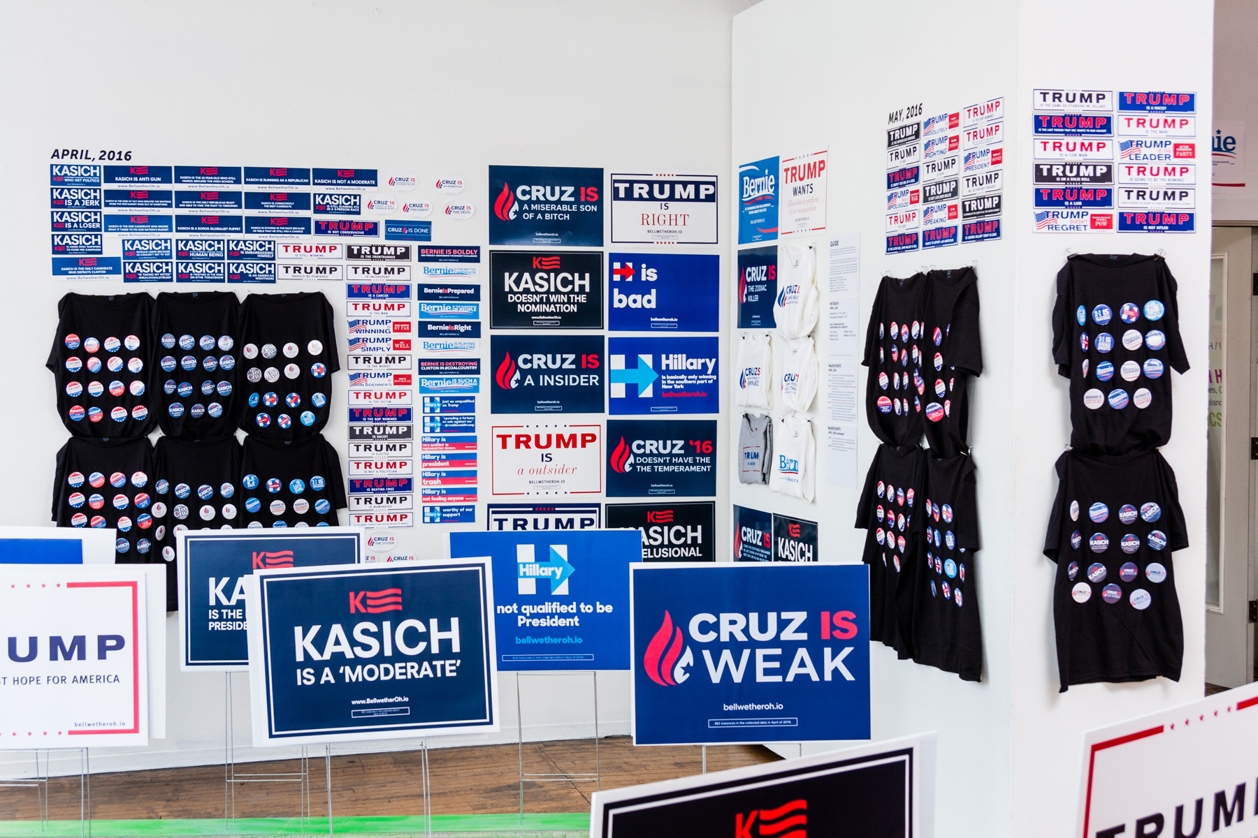
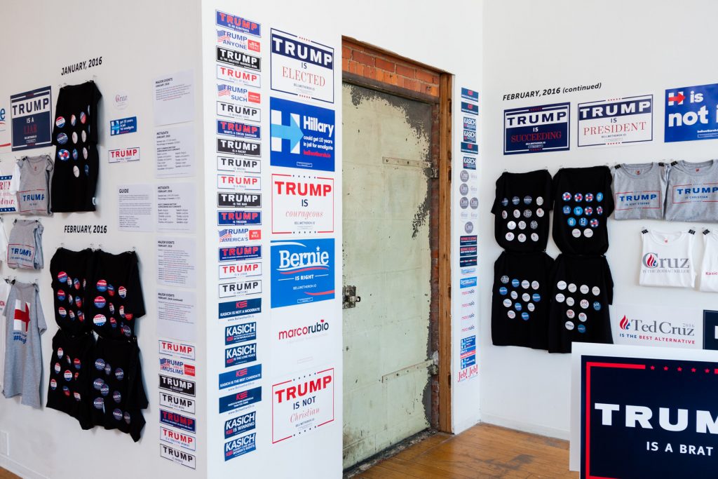
I devised a hierarchy of campaign memorabilia that reflected the number of times a phrase or phrase fragment had appeared in my collected data, based partially on the expense involved in either creating the material myself or purchasing similar materials from a candidate’s campaign website. For example, because campaign buttons were relatively cheap and easy to make in bulk, I assigned them to represent the phrases that got repeat mentions but did not circulate too widely. T-shirts, however, took much more time and effort to make—not to mention were more expensive to produce and buy—and were relegated to a higher tier, meaning that I only produced them for tweets that had gained a significant amount of traction. The phrases that dominated the data to an extreme degree were placed into the highest-tier “specialty merchandise” category, which, in the context of the original exhibition, meant that I created a two-dimensional “proof” of a highly specific, custom-made item only available for one candidate—the Trump “Make America Great Again” hat being the most dominant example over the course of the project.

The output of #Bellwether takes the unpredictable and disjointed nature of social media and mirrors it in the nationally recognized visual language of American politics; campaign merchandise, traditionally limited to the highly vetted and reviewed messaging that politicians want to broadcast to their constituents and potential voters, becomes reflective of this fragmentation and offers insight into how those campaign messages are being read by their target audience. In her review of #Bellwether for Hyperallergic, senior editor Jillian Steinhauer commented that the installation was “the theater of politics—and art—gone populist: you could tweet something, watch it go viral, and then walk into SPACES and find it on a T-shirt on the wall.” Those populist, fragmented, and often conflicting messages contribute to a palpable tension present in the words read throughout the gallery, erasing the unified messaging and support that politicians so desperately attempt to project from within, and instead presenting a reflection of the push and pull between supporting and opposing viewpoints throughout each candidate’s campaign.
A Multifaceted Approach to Public Opinion?
The manufactured campaign merchandise was displayed so that a viewer saw the data in a chronological manner, beginning with the objects representing the August 2015 tweets, and ending with the objects made for July 2016. Upon entry into the gallery, the first thing a visitor noticed was the disproportionate amount of merchandise devoted to the Republican primaries, which speaks to the fact that the overwhelming majority of data did, in fact, come from the Republican race. Trump, naturally, received the vast majority of the merchandise, reflecting his dominance of the news and social media cycles throughout the election season; John Kasich’s relative prominence in the data was also a testament to the fact that I was examining a very small, local community, at least when compared to the national political scene. Because he was serving as the Governor of Ohio at the time of his presidential campaign, and because voters had such an immediate connection to him, including strong name recognition, he appeared in my Ohio-filtered data in a much higher concentration month-to-month than he did nationally.
In contrast to the Republican race, the Democratic side had proportionally less merchandise primarily because the race quickly narrowed down to just two candidates, as opposed to the five or so that stayed in the running on the other side. However, the themes that emerged from that race did make their way into the project—most notably in the lack of immediately viewable or attention-grabbing positive merchandise directed at Hillary Clinton. For instance, in April of 2016, all of Clinton’s lawn signs and rally signs (two and three, respectively, collectively representing phrases found between 150 and 500 times in a month), 71% of her bumper stickers (representing 50 to 150 uses), and 75% of her buttons (10 to 50 uses) contained overtly negative content about her and her campaign, with the remaining phrases containing content that was either visibly positive or neutral. This stands in contrast to her opponent, Bernie Sanders, who, while he received no lawn signs that month, received one extremely favorable t-shirt and rally sign each, and only 12.5% clearly derogatory bumper stickers and 33% buttons, with total numbers comparable to Clinton in each category.
#Bellwether detail, courtesy of the artist and Harlan Levey Projects
In addition, the good things that were said about Clinton throughout the project ended up mostly being matter-of-fact statements related to her experience and her status in the race: “Clinton does not need to win any additional states”; “Clinton is the projected winner”; “Clinton is best for Ohio”; and “Clinton will be president.” In contrast, tweets about Bernie Sanders were generally much more impassioned and enthusiastic: “Sanders is America’s papaw”; “Sanders is speaking to people’s souls”; “Sanders is a once in a lifetime candidate”; and “Sanders is shattering records on so many levels.”
These examples are emblematic of the two types of phrases that were frequently used on Twitter during the primaries. The first were general sentiments that seemed more like fragments or pieces than actual, full thoughts—“Clinton is bad,” “Trump is right,” “Sanders is change,” and the like. The second, by contrast, consisted of elaborate, highly specific, and, at times, lengthy sentences that stood entirely on their own—“Trump is eating a taco salad on top of a bikini clad photo of his ex-wife,” “Clinton is married to the man who signed NAFTA… she’s not bringing your jobs back,” “Cruz is Lucifer in the flesh,” “Trump is basically a YouTube comment section running for President.” This points to a two-pronged approach to examining how users engage with political content, and content in general, on Twitter: The first type of phrase indicates a common sentiment that is found in a variety of types of posts among many different people. The second indicates a mass retweet—someone writing something in a specific, personalized voice, which becomes extremely popular and is shared widely among many, many different user networks.
As opposed to in a polling context, where the opinions of voters are narrowed down to just a few options, the inclusion of both of these types of remarks in this project left the door open for a much broader range of thoughts and stances. This led to phrases such as “Clinton is a liar” and “Clinton will say anything to win” appearing in the same merchandise tier in the same month (in this case, May of 2016); while both express related, negative feelings about Hillary Clinton and her propensity to tell the truth, the first is a simple, generalized statement, while the second goes one step further and ascribes intention to the accused action, making it a fundamentally different encapsulation of a similar sentiment. This is true for more positive expressions as well, evidenced by the appearance of “Clinton is a sure footed foreign policy expert” and “Clinton is the ultimate changemaker” in the same tier that same month (though these numbers were much lower compared to the earlier examples and only merited campaign buttons).
This trend was also visible for each candidate running. “Trump is literally Hitler” and “Trump is fanning the flames of violence/that isn’t leadership/it’s dangerous” were separated in March of 2016 by just 13 mentions; similarly, “Trump is a true leader” and “Trump is a unifier” were separated by 21 mentions in the same month. In each pair of instances, it’s clear that the approval or disapproval of the candidate is the same; the distinction lies in the detail, framing, or reasoning of the statement, and can offer clues about users’ differing states of mind or opinions related to Trump when they posted their respective tweets.
Phrases relevant to the narrative of the campaign, or that took on a life of their own on the internet, also showed up in the data to varying extents, and the type of merchandise that this text appeared on gave the viewer a sense of whether or not the language had any momentum. Additionally, these phrases at times conveyed hints about what the poster was thinking about the candidate without using emotionally loaded language that would traditionally be flagged by a standard sentiment analysis algorithm, instead referencing historical or cultural events that carry meaning. For example, the phrase “Cruz is the Zodiac killer,” a reference to an outlandish meme tying Republican candidate Ted Cruz to an unsolved string of serial murders from the 1960s and ‘70s, debuted in full force in the data in February of 2016—when the meme, which originated in 2013, began to gain a sizeable amount of traction with users on Twitter, and the Internet in general.13 In February, the phrase got 916 mentions in Ohio, enough to merit a t-shirt. By March, however, the frequency of the Zodiac killer appearances in the collected data had decreased to 288, a rally sign, and by May, the month Cruz withdrew from the Republican primary, the numbers had dwindled down to just 2 instances—meriting only a campaign button. Similar trends appeared with many phrases throughout the course of the project: “Trump is Sacha Baron Cohen in disguise” (which, while it decreased over the course of the campaign, never fell below the bumper sticker tier), “Sanders is that kid who was the only one who did the homework,” and “Cruz is Lucifer in the flesh” (appearing almost instantly in the data after former House Speaker John Boehner infamously attacked Cruz with the epithet in April).
Examining this this colorful language stands in great contrast to the information garnered from most polls of Ohio, which generally tend to break down the population as percentages that hold one opinion versus another. By not numerically quantifying the actual opinions present in the data, apart from determining phrase frequency to assist in the manufacture of merchandise, and not boxing in “similar” sentiments into the same categories, the project left room for a much more complex interpretation of Ohio’s public opinion, one that did not necessarily fall into neat, numerical packages stating how many people felt this way versus that, but instead illustrated the overwhelming, multifaceted, and often mercurial nature of social media—and of public opinion in general.
#Bellwether began as an examination of public opinion, but it ended as a tribute to the diversity in political opinions throughout the state of Ohio. The focus of the installation became the language itself, and the things that it was telling us about Ohio voters that could not be forced into the traditional package of polls. Each tweet represented something that someone in Ohio had written about a political candidate, or at least something that a specific user found resonant enough to amplify. By taking these words at face value, rather than trying to shove them into a graph or numerical data structure, we can theoretically see the installation as leading us one step closer to the people themselves, bringing the often lost individual voice back to the forefront in the political polling machine.14