
Issue 4: Bodies and Borders
Remapping the British Raj — An Indian perspective
A look at the creation of India-by-Numbers, a set of interactive maps aimed at bringing forgotten parts of Indian history to life.
Hector
If this were a movie, it would start on a thunderous night of looming skies, as the ship Hector docks on the busy port of Surat in India in the early 17th century. Rain would be pouring down as an elegantly dressed man whose very gait indicates pomp and clout steps off the dock to trade the first of many of his bags of spices.
I’m pretty sure it didn’t go down exactly this way—but the facts are as follows. On August 24, 1608, the British ship Hector captained by Sir William Hawkins docked on the port of Surat to trade spices with India. This marked the first of many trades between India and the British. The British mainly had their eyes on India for its spices, textiles, coffee, and tea.
As the volume of trades increased, the British gained a foothold in India by obtaining exclusive rights to trading from the then-rulers of India—the Mughal Empire, a Muslim dynasty. At that point, India had been under Mughal control for around 100 years and the British Empire was taking off.
Through the establishment and leverage of monopolistic trade relations over the next 150 years, the British wrested control over (pre-partitioned) India. By the mid-18th century, the British East India Company, a royally chartered trading company, had established its own armies in India and conquered large swaths of the land.
In 1857, after the chaos of the India Mutiny, a large uprising against the British, the Crown nationalized the East India Company and took over administrative powers in India.
Overall, the British ruled over India from 1757 to 1857 under the name of the East India Company, and from then until India’s independence in 1947, a time known as the British Raj, under the name of the Crown.
Throughout these two centuries, India saw an increase in wars and famines and a fall in wealth and economy. There were around 120 battles fought during the Anglo-Indian wars, and the Indian contribution to the world economy fell from 25% to 3%.1 Various factors of British rule—including de-industrialization in India, British markets taking over the local Indian economy, and various policies in Indian trading enforced by the British—all contributed to these striking numbers.
But the number that stands out to me the most in the calculation of this period of history is the number of famine-related deaths in India from 1757 to 1947: 60 million.
60 Million
I remember hearing this number and thinking, “But that’s the size of a whole country.” (In fact, it is nearly the size of Italy.)
Once I learned the number, it was easy to find out why the number of famines in India increased under British Rule. As Economics Nobel Prize winner Amartya Sen put it, the famines in the British era didn’t come from a lack of food but from the inequalities in the distribution of food.2 He links the inequality to the undemocratic nature of the British Empire. Looking specifically at the last big famine in Bengal, India in 1943, Sen argues rightfully that there was not a lack of rice in the state; instead, their prices inflated and those who could afford the rice benefited, while the poorer populations ended up starving to death. In most cases, the famines in India came from policies and decisions made by the ruling power, either the British East India company or the Crown.
To summarize it in a few lines does not do it justice, but I’d like to highlight a few key facts and numbers related to the famines:
1. There were 31 serious famines in the 120 years of British rule compared with 17 famines in the 2,000 years before British rule.3
2. There was no shortage of food, just the supply to Indians.4
3. The death toll was just short of 60 million.
The Muse
But in addition to the shock of the staggering number of people who died, the part that hit me hardest about the number was that I hadn’t discovered it until I was 25.
I understand that a large part of this ignorance can be attributed to my prior lack of interest in history. But it also speaks to a larger problem in India, the way history is taught. In my own personal experience and the experiences of those I know, the focus of our history education in India was on the when rather than the more imperative questions: the why and the what.
The problem with being asked only to remember when an event took place is that it diminishes the causes that lead to an event. Perhaps I would have had a greater understanding and appreciation for trials and tribulations in history if the focus had been on the social and cultural forces that explained the motives behind the wars, rather than just their dates and times.
It was when I discovered the famine number that I realized what a skewed view I had of history during the British Raj, and I wanted to be able to revisit the hard facts within the context of the greater story.
As with every story you have ever heard, this is where the muse enters the narrative. At the time I learned about the famine number, I had the fortune of attending ITP and seeing people around me making wonderful projects using data collection and visualization. This motivated me to catalog the history of the British Raj in India in some shape or form.
A quick search on the Internet and at a library revealed a ton of information about the British Raj in India. But what was missing was an easy way to get access to this information. From this experience, I wanted a way to go through history in a sensible manner while still appreciating the details of the British Raj. It was to satisfy this desire that I started working on this project, India-by-Numbers.
A Secret Passage
The project started off with research and collecting more information. I went through books to pick out numbers and names and filled in large gaps in my knowledge and in the data sets I was putting together. All of this eventually filled a couple of Excel sheets that could put financial spreadsheets to shame.
The dataset I spent the most time on, though, was a collection of maps sourced from across the web and libraries—maps from the 18th century that depict different features of India at the time. As someone who is obsessed with the visuals of maps, I found that not only did they make me mildly ecstatic, but I also realized I had discovered a secret passage into the minds of the British.
These maps also provide a concrete way to bring the numbers together. No more were the numbers of the British Raj living on spreadsheets, but they were now all linked to a time and a place. These maps helped me understand India’s history in a way that I had not up until then, and they also helped me understand the British rule in the larger context of how the British and others viewed India—including its borders and divisions, both real and invented by the British.
Among the maps I found, there were quite a few about the Indian famines:
A map from the Chicago Sunday Tribune in 1897 showing famine in India
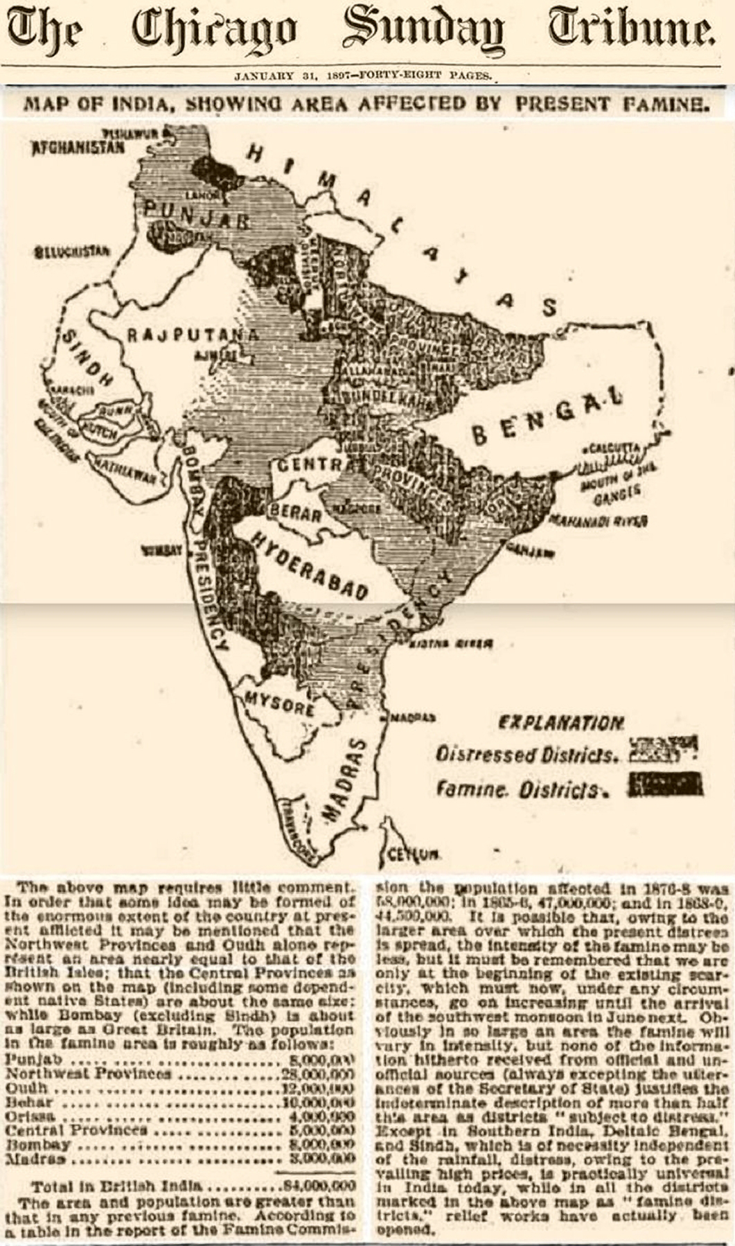
“Map of India, Showing Area Affected by Present Famine,” Chicago Sunday Tribune (January 31, 1897).
A map of Indian famine of 1899–1900 from Prosperous British India by William Digby
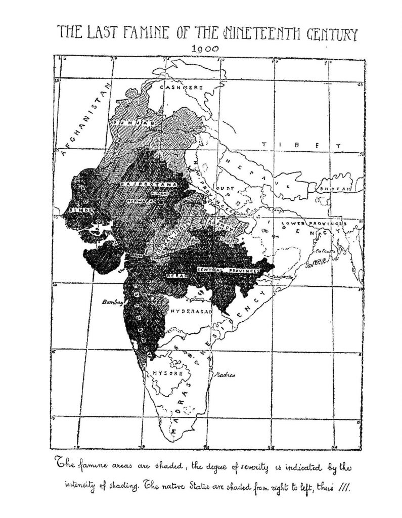
William Digby, “The Last Famine of the Nineteenth Century,” ‘Prosperous’ British India (London: Paternoster Square, 1901).
Understandably, famines that killed 60 million people in a span of less than 200 years is something that can catch the world’s imagination. But I found one map in particular that helped me understand the spread of the problem.
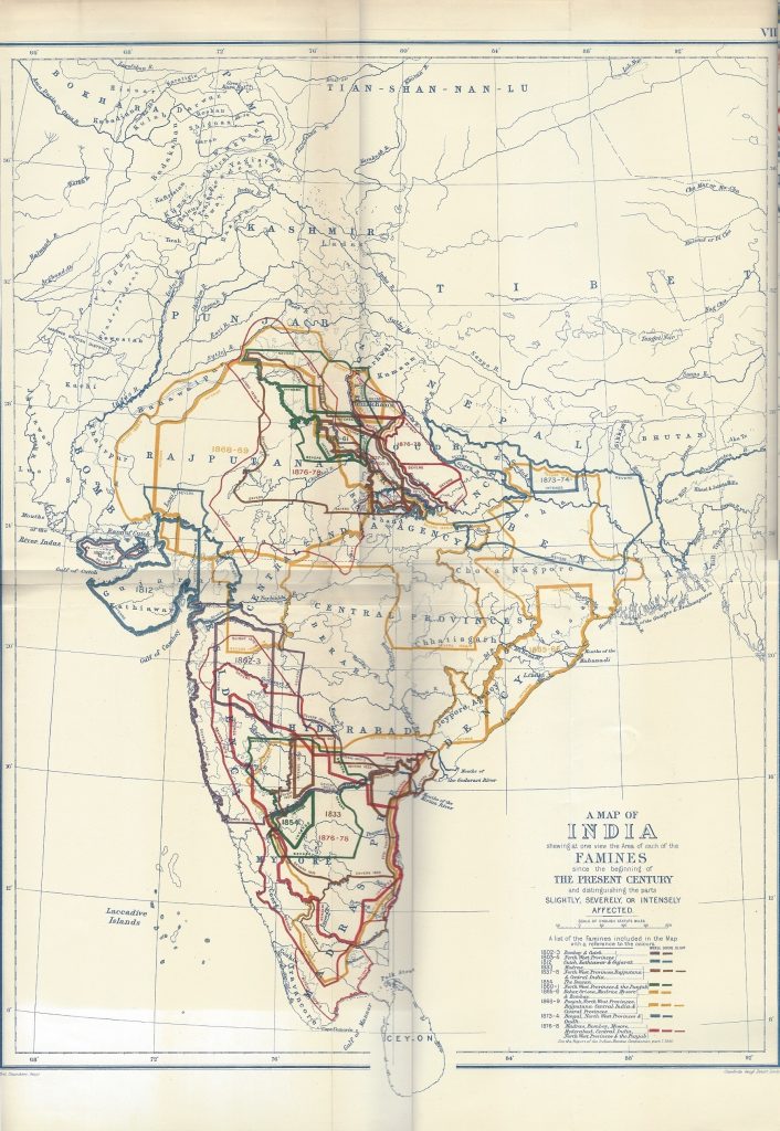
“A map of India showing at one view the Area of each of the famines since the beginning of the present century and distinguishing the parts slightly, severely, or intensely affected,” (London: Stanford’s Geography, 1885).
The map from Stanford Libraries is a collection of all the famines that took place in India in the 19th century. It not only documents the location of each famine, but also the spread based on severity. For example, in its depiction of the Orissa Famine in 1865, in which around one million people died, the maps show that the effects were spread across most of south and east India. But most of the mortalities and severe effects were concentrated in Orissa. This made me more curious about what was happening in these areas at the time of the famine and begin to understand the famine within the larger forces of history.
Inspired by the above map, I collected more maps and pulled out the exact boundaries of various famines and created interactive visuals about the famines. These allow for people curious about the history of India to click and view the spread of different famines. They also give additional information about the severity in various regions, the mortality rates, and other features. It also ties the information to events happening in the British Raj at that time to provide additional context about the numbers.
[advanced_iframe src=”https://mathuramg.com/indian-history/famines/index.html#1″ width=”100%” height=”600″]
The Good Fight
My project is not limited to just the famines in India; the maps and the data have formed the basis for many posters, visualizations, and infographics about many different aspects of the British rule in India.
They have helped me understand the timelines of the wars,
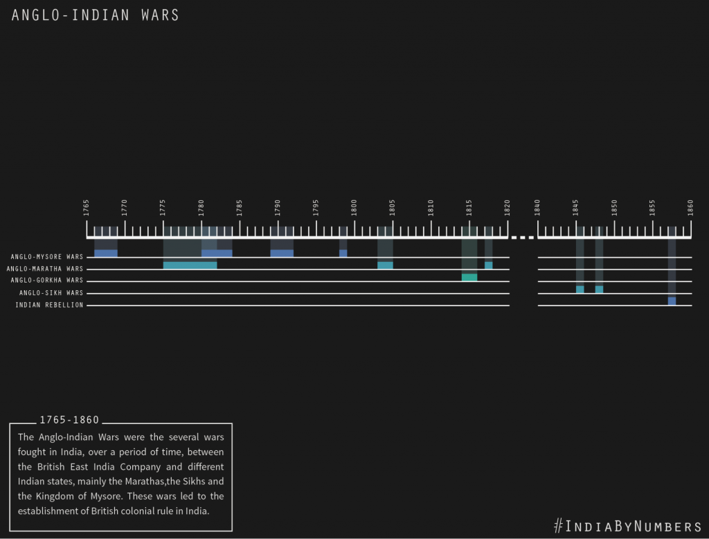
The placement of battles (and their proximity to my hometown, Mysore),
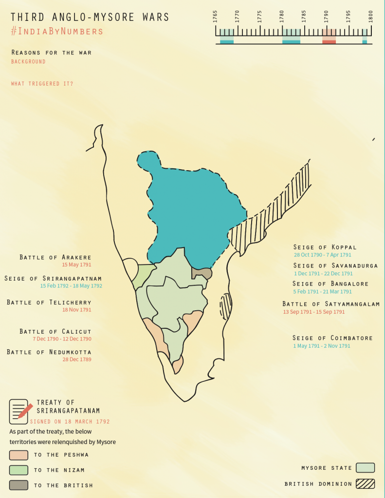
And the expansion of the British Raj.
* * *
I guess the ultimate question is: “So what?”
I started making this project as a way to consolidate data about the British Raj. Through the course of my research, however, I have learned more than I expected. The most important takeaway for me is that India has stood together as a large community through the tough times. When we realized that we were losing our motherland, we came together to win it back—once in 1857, and then more successfully in 1947.
And yet today we still are part of a fractured community, where border disputes and religious riots are everyday news. And once again, people in the country are trying to divide us the way the British did. Only today, it takes the name of politics and vote banks.
We are taught history as children so that we don’t repeat the mistakes of the past in our future, but today, that is exactly what’s happening. Maybe it is time to take another look at our history and hope that this time, it sticks. This is my meager contribution toward that.
To me, this project has just begun. I hope that it encourages more people to think of ways that they can contribute to remembering the good fight we fought.
—
All of the information that I am collecting is open source and is available here.
The project itself is and forever will be a work in progress and can be viewed here.
If you have any question or would like to participate in this project, you can email me at mmg542@nyu.edu.