Examining the impact of the pandemic through data storytelling
THE PANDEMIC FADES…
THE IMPACT LINGERS
COVID-19 exposed systemic racial inequities, disproportionately impacting communities of color. How can we repair the breach and build resilience for our communities?
Our goal is to make the COVID-19 IMPACT PROJECT the leading data storyteller of the COVID-19 pandemic by documenting the pandemic’s unequal impact on communities of color, and sharing the historical precedents and lingering effects of this ongoing inequity.
WHAT DOES COVID-19
IMPACT LOOK LIKE
WITHIN NYC?
COVID-19 exposed systemic racial inequities, disproportionately impacting communities of color. How can we repair the breach and build resilience for our communities?
Hover over NYC’s map to find out mortality versus income rates in each neighborhood on 2020-07-29.
VISUALIZING COMPREHENSIVE COVID-19 DATA:
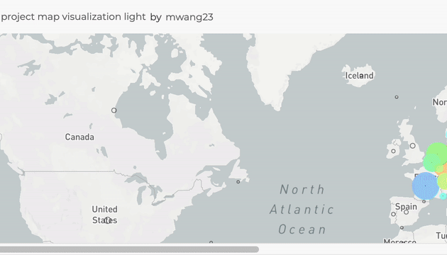
Cara Cai, a first-year ITP student in the Data Storytelling for Social Resilience class, created an immersive 3D visualization using one of the most comprehensive GLOBAL COVID-19 datasets from Johns Hopkins University, capturing daily data over a 3-year period.
Click below to interact with the full visualization and discover how Cara built it.
COVID-19 DIGITAL MEMORIAL
This memorial holds space for us to grieve more than one million loved ones, family members, co-workers, neighbors and friends who died from COVID-19 in the United States. We offer our memorial to those who appeared in the data from January 22, 2020 through March 9, 2023, and to those who have not been counted.
DATA STORYTELLING
Here at New York University’s Tisch/ITP program, we offer a graduate course that broadens the exploration of pandemic data and invites graduate students from diverse schools and departments within NYU to contribute to the COVID-19 Impact Project according to their skills and interests in emerging media.
Students learn the fundamentals of data literacy, study historical uses of data visualization for social justice, explore tools for extracting stories from data, and contemplate community grief and mourning for mass death events. Students apply their learning to a passion project to tell a human-centered data rich story.
EXPLORE THE DATA
Our COVID-19 Data Dashboard for worldwide pandemic cases and deaths gives you multiple ways to research and understand the pandemic’s impact from the global scale all the way down to local communities.
For all countries and regions, the dashboard allows you to compare global and regional trends over the course of the pandemic, evaluate population impact, easily find the first reported deaths in any country, and much more.

MEDIA GALLERY
Project Photos and Videos
“One of the most impactful statements from the Color of Care documentary was the statement that there are moments in history when great progress is possible, and this is one of those moments.” (Fazil Kahn, Panelist, Color of Care Documentary and Panel Discussion @NYU)


