


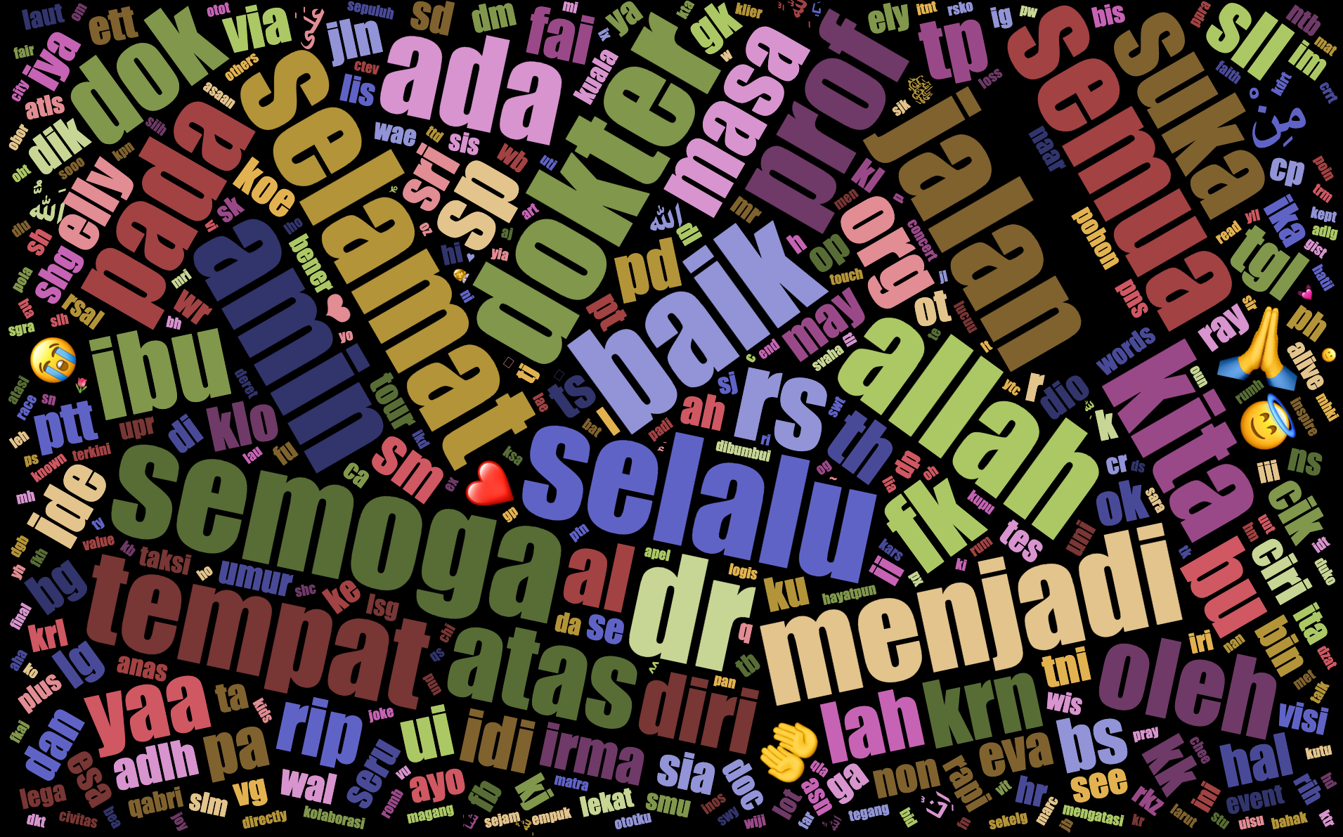
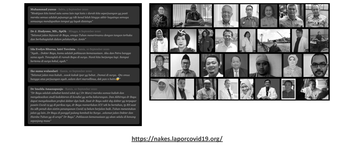
Indonesian Medical Heros (2021)

Death is pretty interesting, in that there is grief and sadness but it brings people together in expressing love and memories.”
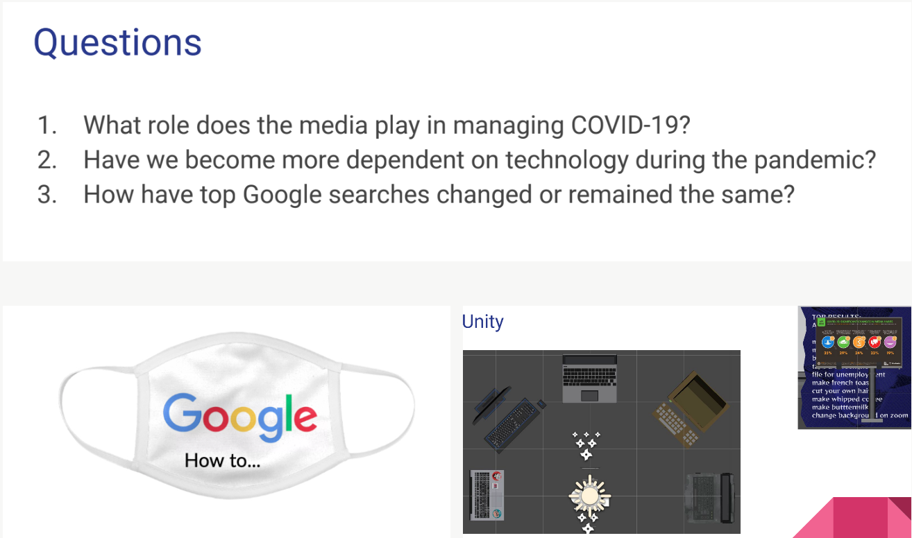
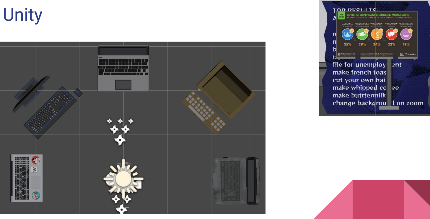
Role of Media in Managing Pandemic (2021)
Student sought to explore the questions listed here.

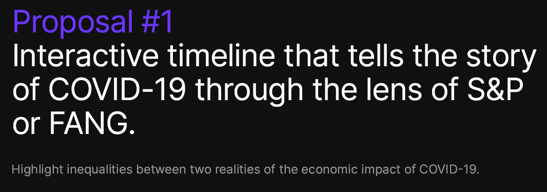
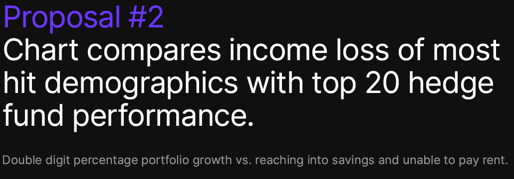
“Detached” Economic Realities of the COVID-19 Era (2021)
On the other hand some people fled dense metropolitan areas for their secluded country mansions and villas.
Others (almost) seamlessly transitioned to remote work. And the newly designated “essential workers” kept us fed, provided medical care at extreme personal risk. Sounds like a recipe for tumbling market indices but instead the stock market kept growing and growing in leaps and bounds.
For me throughout COVID-19 I see my friends from two different backgrounds. I have friends with investment portfolios going up double digits and there are people who cannot pay their rents.
Based on personal experience, student eloquently begins the conversation on the detached economic realities brought into stark relief during the COVID-19 pandemic.
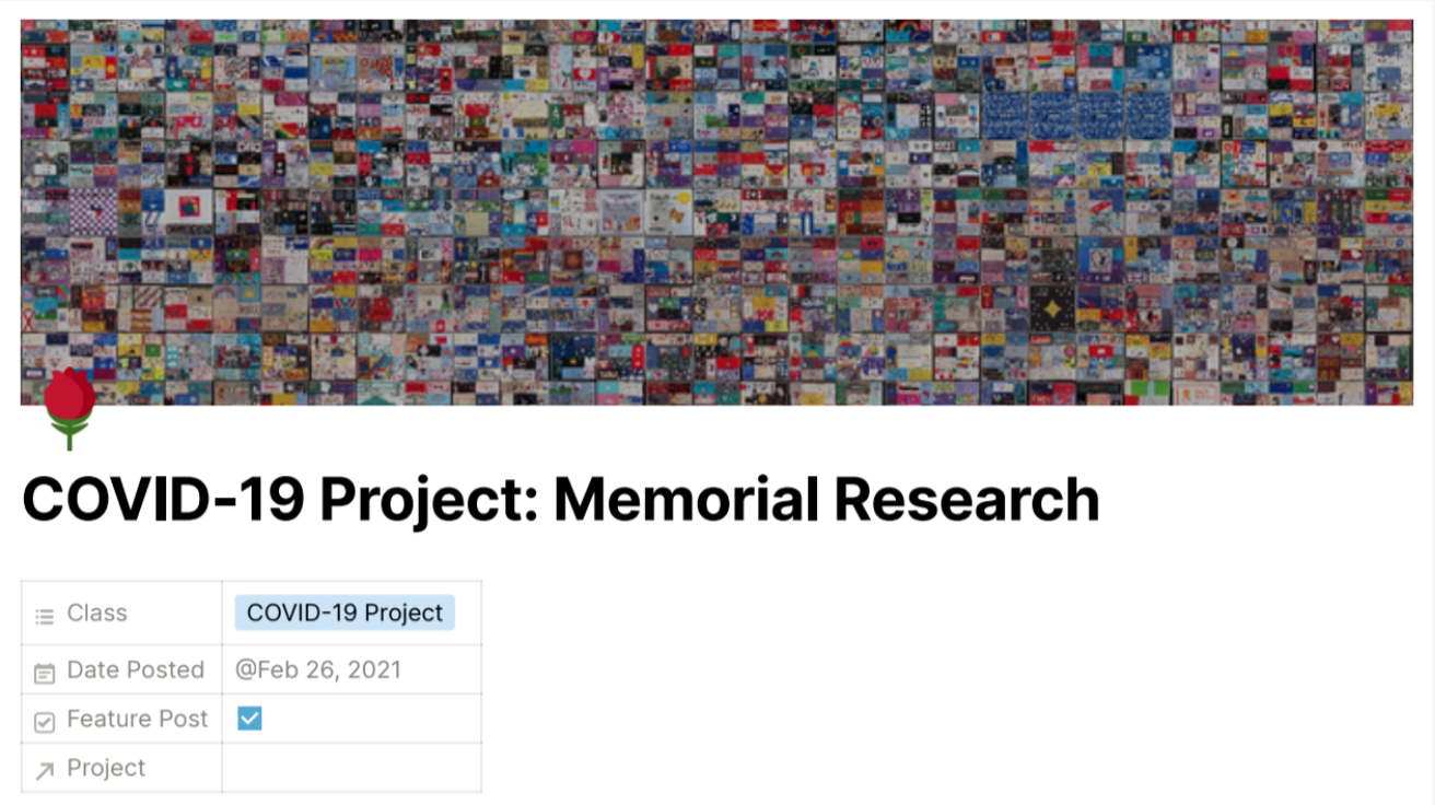
Research on Memorials for Mass Death Events (2021)
Student’s Final Reflections:
“Most of the information pertaining to specific communities is done by accumulating submissions from community members. I would like to continue this research by focusing on the following: Memorials around other viral outbreaks globally & Community memorials around mass death.”
“Datasets that I would be interested in seeing: Queer/trans lives impacted by COVID(race, ethnicity, age, location, wealth, income) & Datasets showing COVID impact by wealth and income.”
“I am also interested in telling the story of those impacted by COVID and HIV/AIDS.”

Political Decisions and the Course of the Pandemic in Israel
(2021)
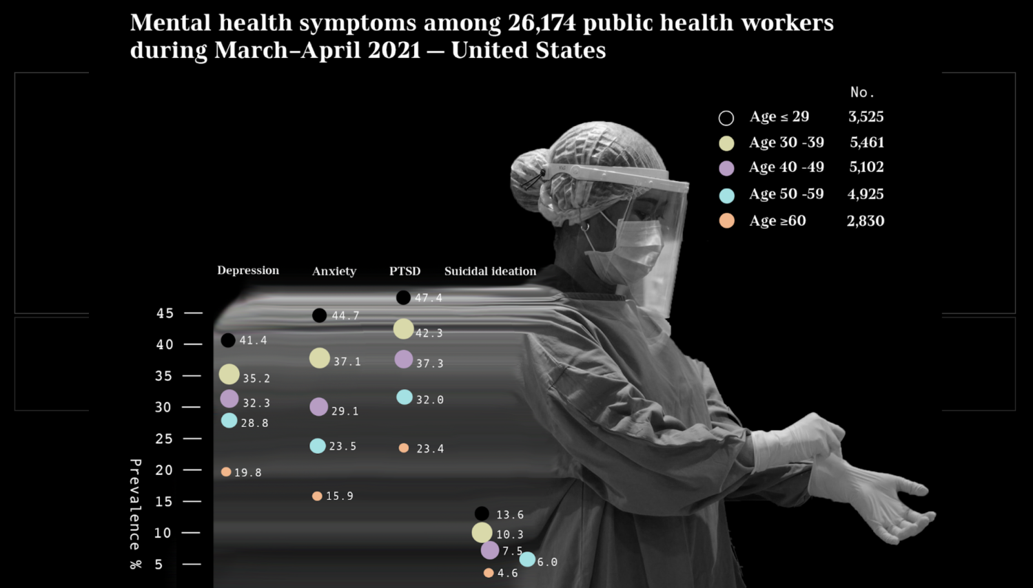
Visualizing Statistics on Mental Health of Healthcare
Workers in the Pandemic (2022)
Project Rationale: “Young adults have experienced a number of pandemic-related consequences, such as closures of universities and loss of income, that may contribute to poor mental health. During the pandemic, a larger than average share of young adults(ages 18-24) reported symptoms of anxiety and/or depressive disorder (56%). Compared to all adults, young adults are more likely to report substance use (25% vs. 13%) and suicidal thoughts (26% vs. 11%). Prior to the pandemic, young adults were already at high risk of poor mental health and substance use disorder, though many did not receive treatment.”
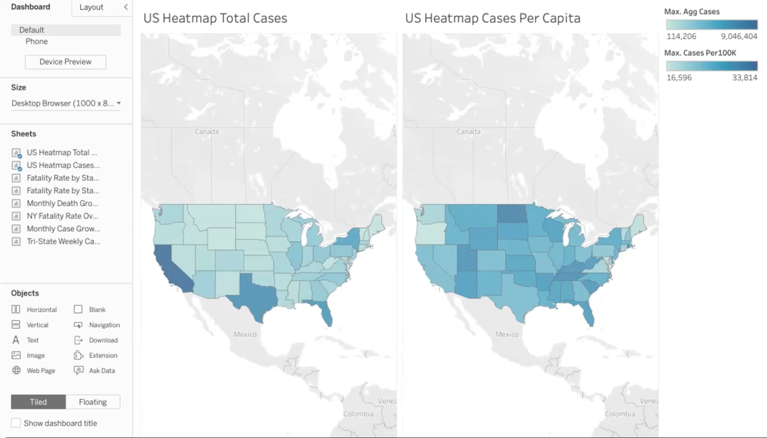
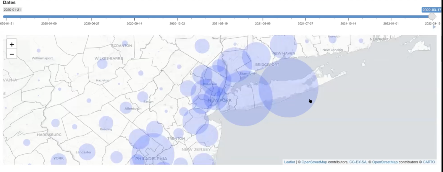
COVID-19 Data Visualization using Tableau (2022)
Data visualizations analysis include:
- Heatmap (Total deaths vs. Per Capita deaths)
- Fatality Rate Comparisons over time (early in the pandemic vs Spring 2022)
- NYC Fatality Rate Over Time
- Case Growth in NYC
- Tri-State Weekly Case Growth %
Developed App using R to Allow Users to View Cases and Deaths
by County Over Time for the Entire Pandemic (2022)
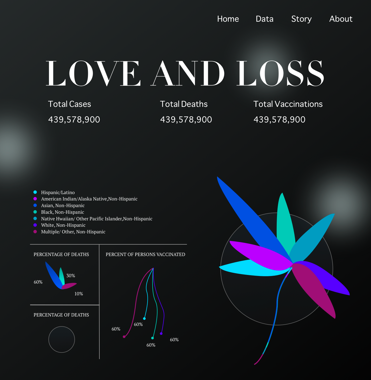
Love & Loss – Exploring Data Humanism for COVID-19
Data Visualizations (2022)
I want to tell story in a light but beautiful way.
Project Rationale: It’s easy to forget but important to remember. COVID-19 Data often shows in countries/ regions, but we need to look deeper. I want to figure out the relation between race, occupation, living places, and the risk of infection. Using different scales to make people gain more insights about what going on in different groups of people.
Love & Loss Documentation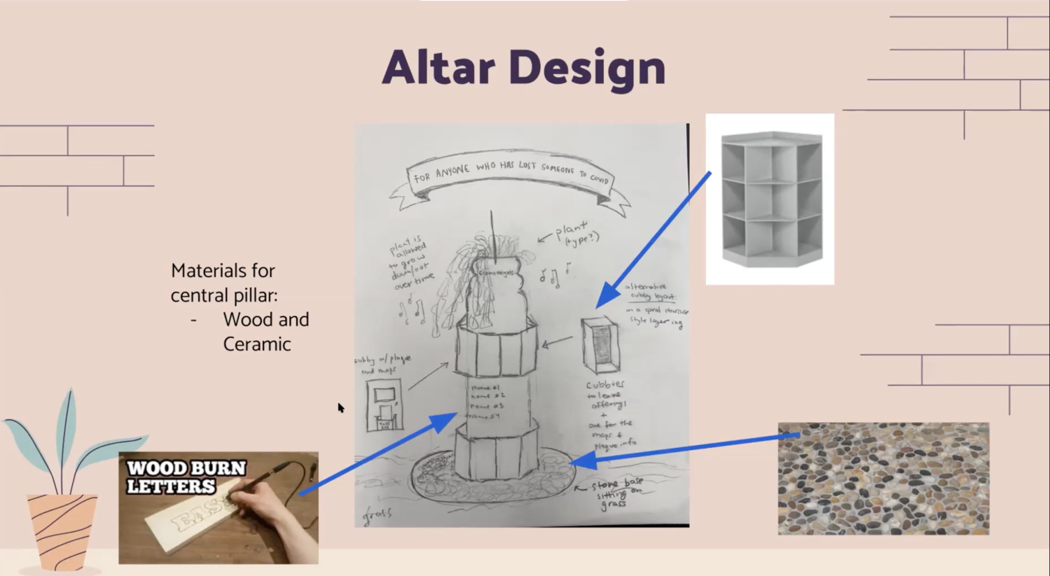
Designing Modular Local COVID-19 Memorials with Community Input (2022)
Project Rationale: Covid-19 Memorials are massive in scale aimed at demonstrating the sheer numbers of those lost. While names and faces are included in some of them the impact of each still feels like it highlights more the mass scale of the pandemic and brings up feelings of how the crisis was handled. Memorials also tend to have a single location and pilgrimages are made to visit it and remember in one site, but (while I would argue Covid was not a communal experience in the way the AIDS crisis was) Covid was a universal experience (in a way US citizens don’t usually experience) and I think a memorial should reflect that through its accessibility. I think a Covid-19 memorial would benefit from being smaller and more localized.
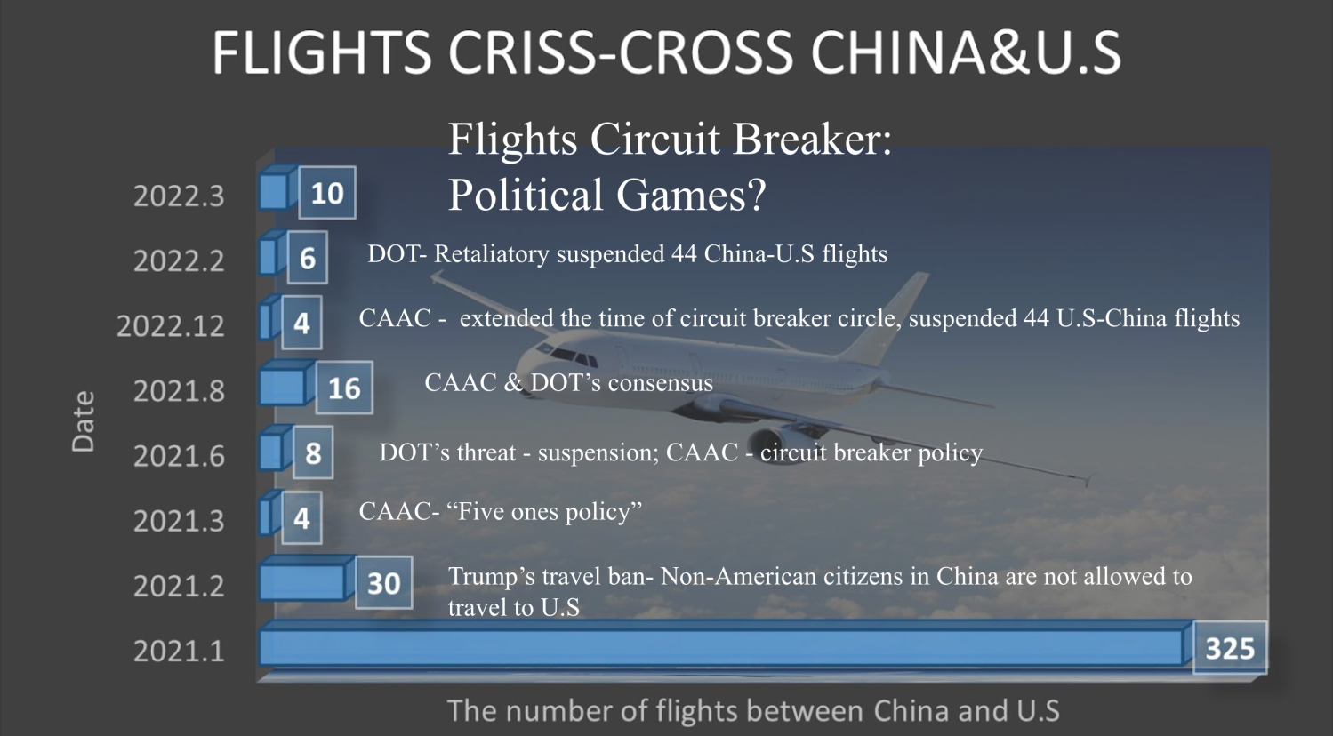
Effect of Travel Ban on Chinese Citizens and Residents in America (2022)
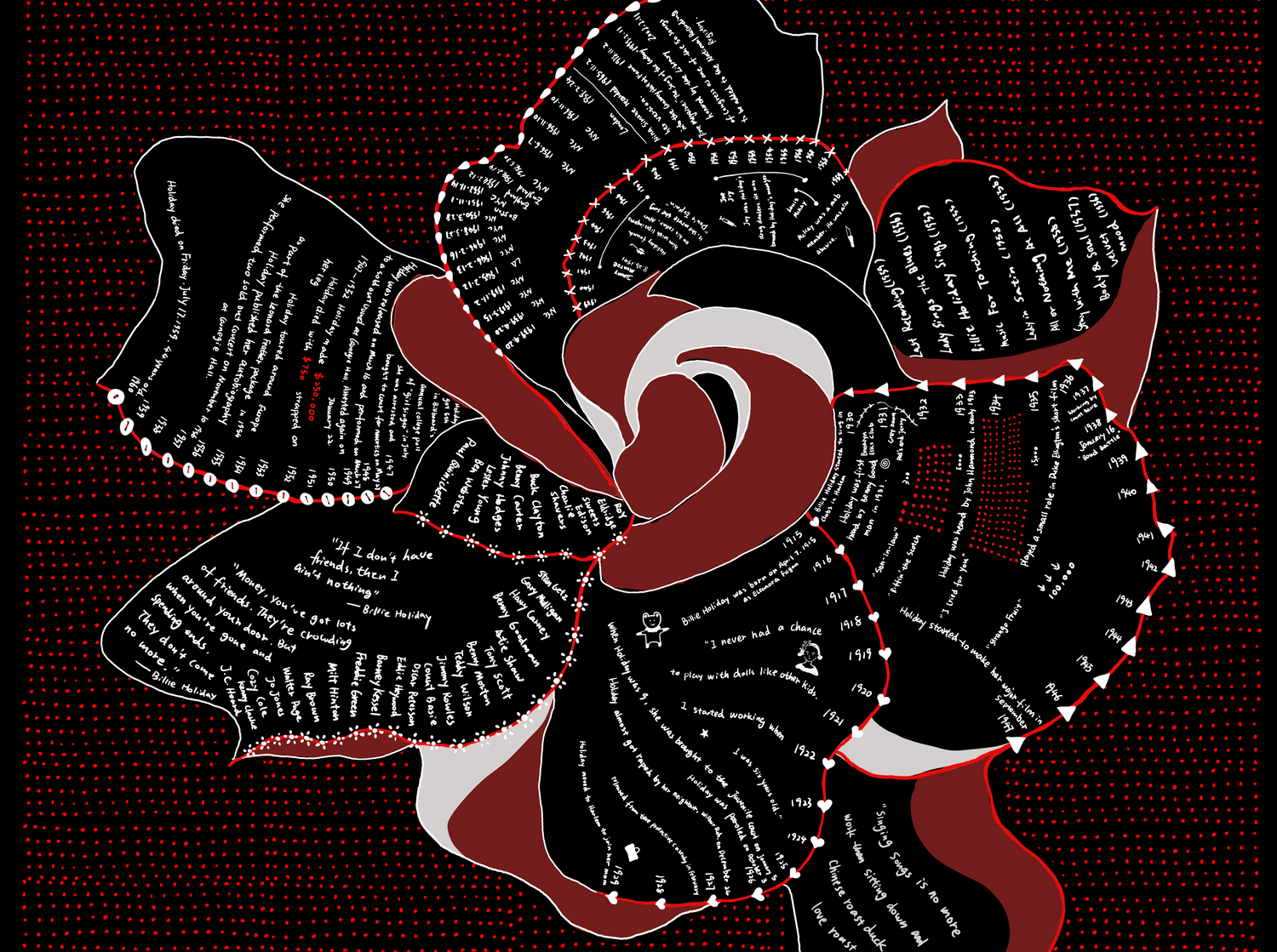
Love letter to Billie Holiday (2023)
Project Rationale: Jazz is one of my favorite genres of music. After taking the Jazz History class in my second year, I became aware of the struggles the musicians I am listening to were facing.
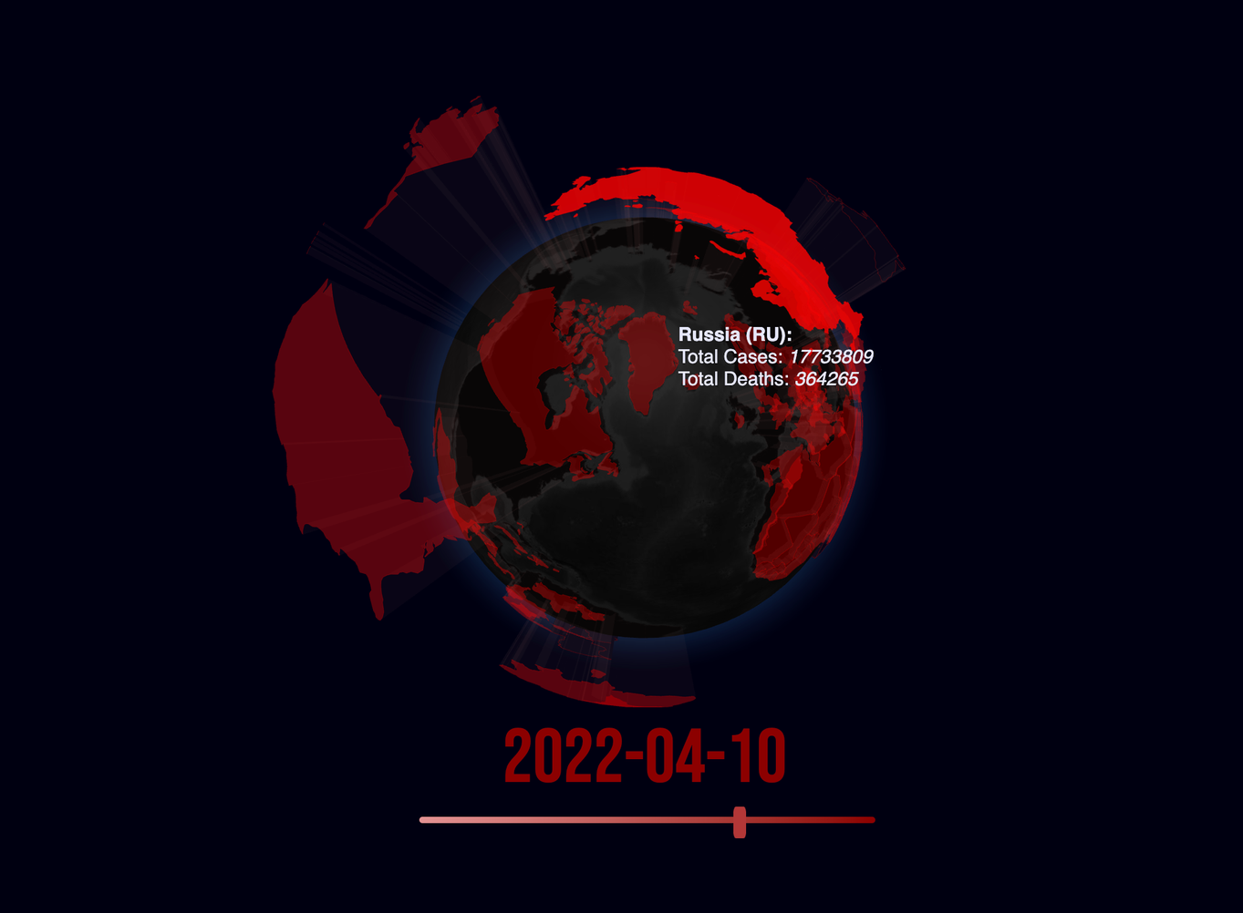
3D map visualizations-COVID-19 Data Visualization (2023)
Project Rationale: With that inspiration, Cara set out to build on work by Patrick Nasralla and create a 3D visualization of COVID-19 cases and death on a global scale for the duration of time when global data was being collected. Remarking on the limited timeframe of the Nasralla 3D globe and its failure to account for small regions, Cara continued to work on her project, making it a central application of the COVID-19 Impact Project.
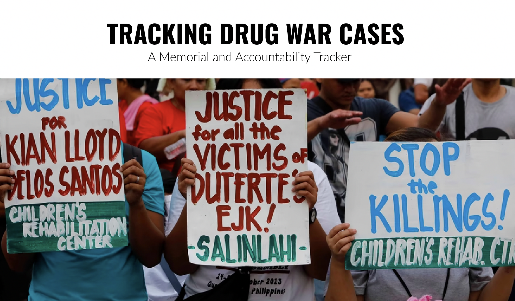
Tracking Drug War Deaths in the Philippines (2023)
Project Rationale: Anthony was motivated by a concern that there is a tendency to forget major traumatic episodes in Philippine history. He wanted to combine the hard disturbing facts that the data on drug war deaths illustrated, with the stories of the human beings caught up in this war.
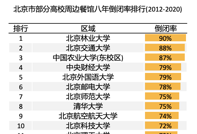
The Disappearing Restaurants near Beijing University Campus and the Memory Lost (2023)
Project Rationale: She was curious as to whether there was data on restaurant closures in Beijing and whether it was linked to the COVID pandemic. Having found the data she sought to humanize the numbers with a photo journalistic essay juxtaposing the past and the present.
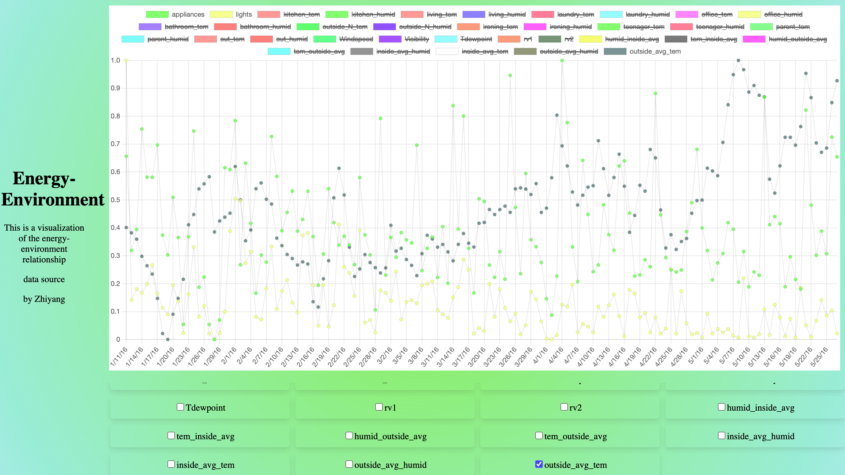
Visualization of the Energy-Environment Relationship (2023)
Through the analysis of a comprehensive dataset encompassing key parameters such as appliance usage, indoor and
outdoor temperatures, humidity levels, and meteorological data, my primary aim is to unveil a compelling narrative that provides insights into optimizing energy consumption for a more sustainable lifestyle. Employing data analysis and visually engaging representations, I endeavor to articulate the story concealed within energy use and offer pragmatic recommendations for fostering a greener future.
Project Rationale: Zhiyang attended the world’s largest youth-led energy conference (Student Energy Summit 2023) in Dubai, and was inspired to find, unpack and visualize data pertaining to the patterns of daily energy consumption in today’s households. By using data as a tool, I aim to offer valuable insights into energy consumption patterns that can aid in making informed decisions towards a greener and more sustainable world.

Impact of COVID-19 on Mental Health and Related Services (2023)
COVID-19 has not only brought about mental issues for more individuals but has also impacted mental health services, making it difficult for many individuals with mental illnesses to seek treatment. I have heard of cases where patients were unable to receive treatment due to quarantine and ran out of medication, leading to a worsening of their mental health conditions. Project Inspiration: Callie was curious about whether or not there was data that would provide insight on how mental health and mental health resources in different populations were affected by the COVID-19 pandemic.
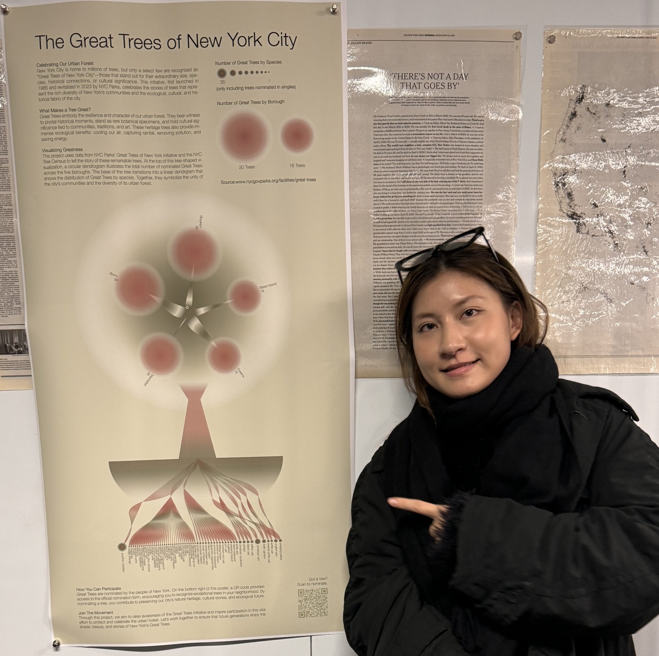
The Great Trees of New York City: Celebrating Our Urban Forest (2024)
Project Inspiration: “The Great Trees Search was a New York City wide initiative started by NYC Parks, celebrating the historical, botanical, and cultural significance of trees across the city. In 1985, and again in 2024, NYC Parks initiated the Great Trees Search and announced the results of the public nominations process, which currently lives on their website. Anyone can nominate a great tree in their neighborhood. And this poster pays homage to the Great Trees Search initiative [and brings] the Great Trees of NYC database offline, spreading awareness about this excellent initiative.”
Death as an Unmanageable Sum [Proof of Concept] (2024)
Project Inspiration: “My inspiration for this project started from the ‘War on Gaza: Know Their Names’. This video lists all the names of the deceased in order of age. This method individualizes each casualty, and in categorizing by age, uses both the visuals of the listed names but also time to inform and impact viewers. It takes 1:15 minutes to scroll through the deceased under the age of 1. The entire video is an hour long, listing casualties from age 0 – 101.”

Where Cradles are Counted: A Data Visualization of China’s One-Child Policy (2024)
Project Inspiration: “As an only child born and raised in China, I grew up with the One-Child Policy and saw its changes over the years. I consider it something that shapes my family relationships, and I have heard anecdotes—like whose mom went to Hong Kong or abroad to give birth—as I was growing up. It has always been something that people tacitly accept, yet there’s so much I don’t know, such as how it came into being or what impacts it had on women’s bodies. The project can be seen as a tribute to my childhood and my family.”
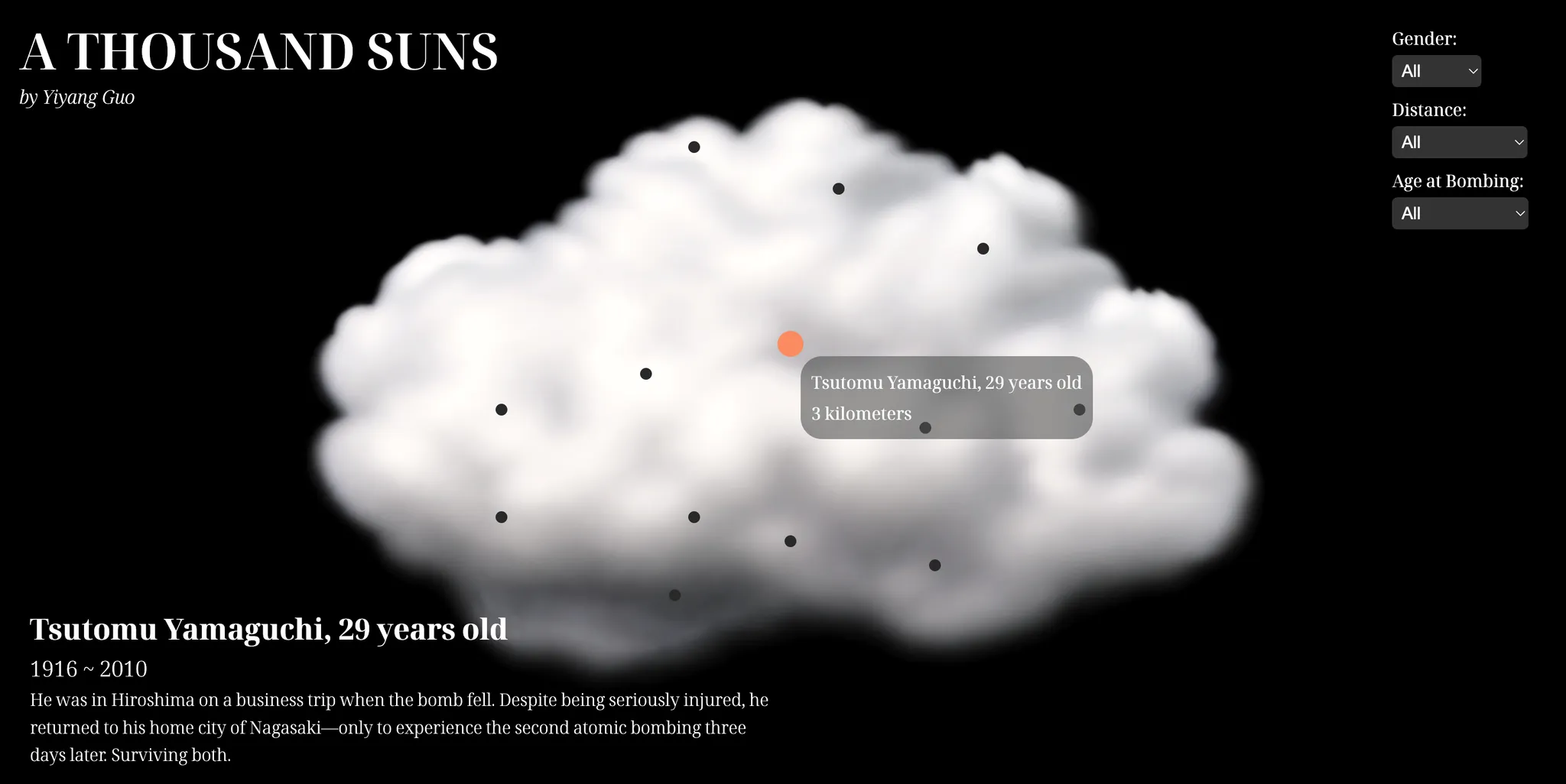
A Thousand Suns (2024)
Project Inspiration: “Even though the atomic bombings of Hiroshima and Nagasaki occurred 80 years ago, the physical and psychological trauma inflicted on the Japanese population remains profound and long-lasting. However, humanity seems to have failed to learn from this tragedy, gradually forgetting the pain caused by World War II as time passes. War continues to plague the world, with countless civilians still losing their lives, being displaced, or suffering from hunger due to ongoing conflicts.”
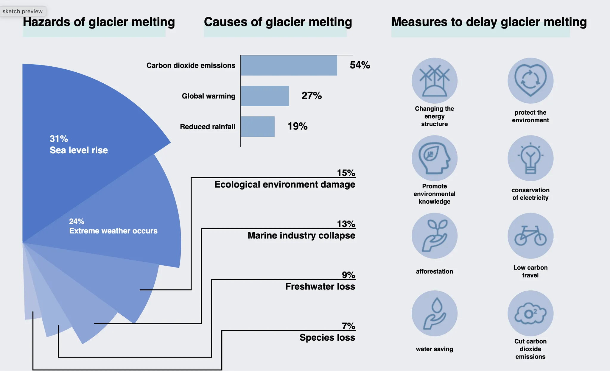
The Vanishing Glaciers: Mapping Melting Across Regions and Time (2024)
Project Inspiration: “Glaciers are vital to the Earth’s freshwater supply, and their loss has far-reaching consequences for ecosystems and human populations. Inspired by the Dendrochronology of U.S. Immigration 1790–2016, I want to use the visual metaphor of crystal snowflakes to illustrate glacier retreat across regions and time. This topic is driven by my passion for environmental issues, particularly climate change, and the need for accessible, engaging data visualizations to raise awareness.”
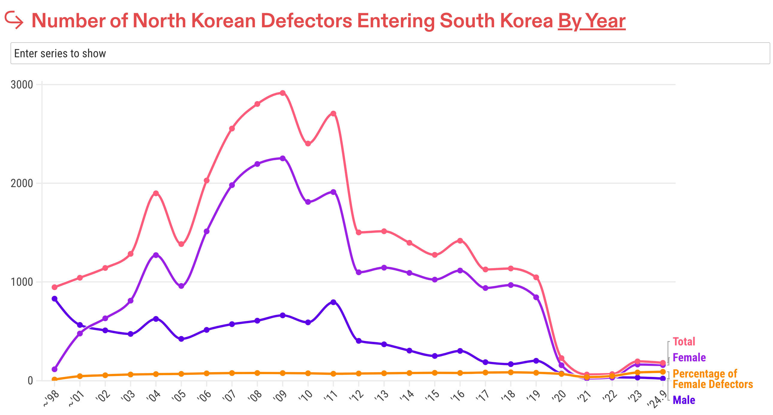
North Korean Defector: The Journey to Freedom (2024)
Project Inspiration: “I am personally always interested in global human rights issues, and especially in uplifting unheard voices from marginalized communities. I have been researching North Korean defectors since last year and feel deeply moved when reading their stories or watching interviews/documentaries about their experiences.”
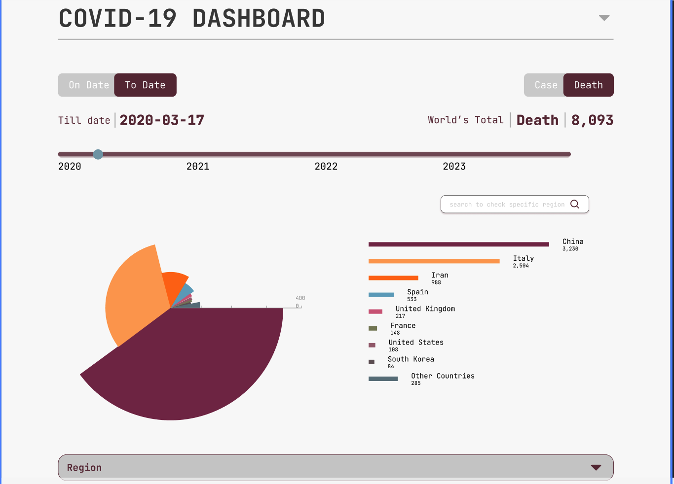
Reimagining the COVID-19 Dashboard: A UX Pitch (2024)
Project Inspiration: “The COVID-19 pandemic reshaped how we consume information, making accessible and accurate data dashboards essential. While the existing dashboard is robust in functionality, it could benefit from more intuitive design and refined usability. My pitch stems from a desire to bridge the gap between data complexity and user-friendly storytelling, helping users make informed interpretations of the pandemic’s trends.”

Quotes from CEOs (2024)
Project Inspiration: “Most of us rarely question what people in power say. I wanted to build a project that highlights the gaps between statements made by tech leaders and the real impact their companies (and the tech industry as a whole) have on our world. By presenting data that encourages viewers to think critically and discuss these issues in a productive way, I hope to spark more thoughtful conversations around the future of technology.”

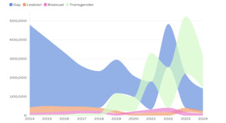
Mapping Inclusivity: Global LGBTQ+ Chorus and Community Visualization (2024)
Project Inspiration: “Having volunteered with the Beijing Queer Chorus and the Shanghai Hyperbolic Singers, I witnessed firsthand the empowering sense of community these non-profit LGBTQ+ choruses provide. Many queer individuals are unaware such communities exist. By mapping these groups worldwide, I hope to offer a resource for LGBTQ+ individuals seeking support and identity through music. My personal experiences and the challenges these groups face have motivated me to bridge this information gap and foster inclusivity.”

The U.S.–China Trade War: Unemployment and Economic Fallout (2024)
Project Inspiration: “We wanted to illustrate how trade policies and diplomatic disputes directly affect people’s livelihoods. It’s easy to see a ‘trade war’ as just numbers in the news, but behind those numbers are families and communities. By revealing the data on unemployment and the economic repercussions, we hope to prompt more empathetic conversations about policy decisions and their consequences.”

Big Apple/Wintry Tomato/Art Onion – Peeling Back Some Layers of NYC’s Art Landscape
Carriage of Thoughts: What’s on your mind today?
Project Inspiration: “ My motivation is my personal interest in anonymous communication as emotional release and a desire to build something gentle, non-intrusive, and community-driven, where attention spans are short but intention is sincere.”
Say My Name
Project Inspiration: “ My original motivation for this project was one day I came across an article asking, “Where have all the lesbians gone?” I realized that, although these identity groups are equally large, they receive wildly different levels of media exposure and public discussion—I mean, where are my bisexual buddies?”
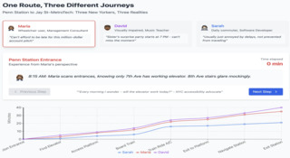
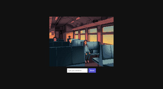
Same Destination, Different Journeys
Project Inspiration: “In NYC’s dense transit system, stations may seem equally accessible—but for wheelchair users or blind/low vision travelers, each journey can be drastically different. This project explores how accessibility at the subway affects the travel experience of people with disabilities. Despite NYC’s progress in transit accessibility, many stations still offer unequal experiences to disabled users due to unreliable infrastructure and poorly communicated features. These gaps remain hidden to most but drastically shape everyday mobility.”
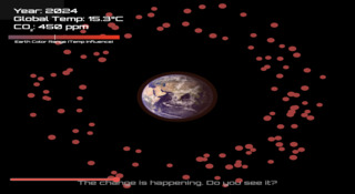
HEATSPHERE: A Visual Orbit
Project Inspiration: “Climate change is often presented through statistics and charts, which can feel abstract and emotionally distant. I wanted to create a piece that lets people **see the heat**, **feel the pressure**, and **realize the story** behind global warming. Inspired by visual narratives and sci-art projects, the goal was to **bridge data and empathy**— not just inform, but confront.”
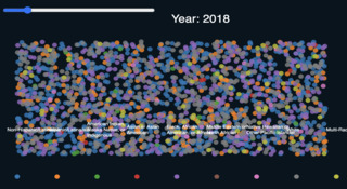
Racial Disparities in Homelessness
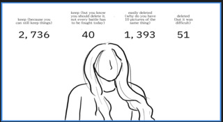
What Still Lingers: The Story of my Kept Digital Data
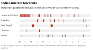
Internet Affluence: Internet Access Inequality and the Impact of Shutdowns
Project Inspiration: “These are the story beats I’m planning to hit in my physical showcase with LEDs built during Nature of Code class in the Spring Show and I’ve utilised this class to flesh out the story. The idea is to have a series of visualisations in succession with short text accompaniments.”
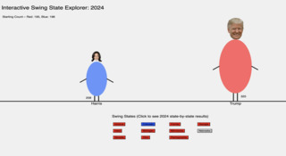
Interactive Swing State Explorer: 2024
Project Inspiration: “Initially, I wanted to visualize the relationship between U.S. economic indicators, public sentiment, and voting outcomes in election years. However, after reviewing a certain amount of data, I realized that there isn’t a strong direct correlation among the three — each factor is influenced by many other variables. Still, I wanted to stick with the theme. Since it’s difficult to find clear connections between two specific factors, I decided to visualize the data outcomes directly. So I chose to visualize the 2024 swing state voting results and the final election outcome.”
What aspects of this course were the most important or helpful to you? — Reviewing examples of successful story telling using data visualization.
There is a lot to cover and 3 weeks is tough. I appreciate the inspiration I got out of the course and look forward to incorporating it into my art practice ! Thank you !
The project structure and feedback opportunities were really helpful. I felt like I was able to craft and develop an idea that was thoughtful, interesting, and utilized the information in the course.
All the information they [shared] was very interesting, they encourage you to be creative and make your project as the best as you can.
What aspects of this course were the most important or helpful to you? — Going through different storytelling methods, seeing how making meaning out of raw data can affect human lives.
I liked that people came to the course with different perspectives, whether they wanted to create memorials, visualize data, tell stories, or program. I felt like I learned a lot from my peers.
What aspects of this course were the most important or helpful to you? — Looking at different approaches and voices for covid memorials and grieving; learning about the historical data visualization is helpful as well.