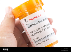
The form that I intend to use for my guide is a pharmacy medication label.
- Why this form? What are its features (stylistic, experiential)
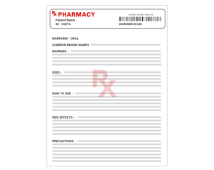
Medication labels typically show how the medicine is used and consumed, what are its ingredients, and what are its side effects. It is very detailed and has a serious tone.
- How is this form typically used, and what do you plan to subvert/imitate/utilize?
I chose this form because it relates to my topic of medicinal uses of cinnamon (bark). I think the pharmacy bottle and label will emphasize that cinnamon is directly used in medicines, which is something that people often don’t realize. Using typical western medicine packaging makes the audience reconsider whether organic ingredients should be considered medication at all. I also what to use the “side effects” portion of the label to describe the ethics and sustainability of cinnamon production.
- What would change if you tried a different form? What critical lens does the form you’re applying emphasize?
Another form that I brainstormed for this topic were infographics on the production of herbal medicines. Initially, I thought I could draw visuals on the lifecycle of cinnamon production, but I felt infographics was too straightforward and that using the medication bottle would be a better metaphor to describe the medicinal use of cinnamon.
- Is there a metaphor well-suited to your form (i.e. cooking with code)? Or, are there other metaphors you might employ?
It would be a visual metaphor, taking a spin on a commonplace item to describe my topic.