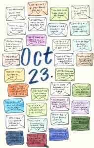
For my daily practice, I decided to create illustrations/infographics on my topic, “How email affects climate change”. Each day, I plan to create an illustration of all the junk email I receive for that day, and organize the information to see what patterns/conclusions are formed. For Day 1, I drew an envelope of each junk mail I received for the day and color coordinated from each sender to see a high-level overview of which company sends the most emails in one day: