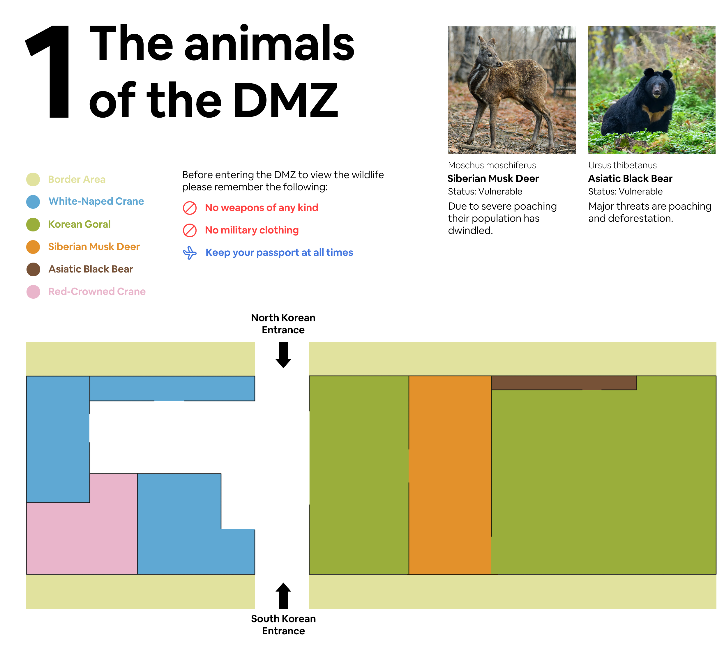
I chose to do a map for my guide, like a museum map or something similar. There are metaphors around what is considered to be an attraction and also in terms of what is highlighted on the map vs what isn’t. Usually this is used for the showcasing of art or laying out a space for a functional understanding and as an accurate depiction of what an area will look like. I’m going to subvert it by taking the actual map of the Korean DMZ and creating a rigid box structure (like a museum map) with general areas highlighting an aspect of the DMZ. It will resemble the actual map of the DMZ in terms of orientation and general geography, but is a huge oversimplification adding structure to an area that is quite fluid. If I were to do a different form I might need to highlight the history of the DMZ, but I’m much more interested in the present and how the DMZ shapes the modern landscape.
The translation into a “Museum” map is an exciting leap into thinking about your topic through a unique lens. To address the fluidity/time-based component, perhaps several maps indicating the dynamic nature.
In addition to the content of the “Museum” map, I’m curious about the color palette and typography you chose for the map and how these elements critically contribute to the intention of your project.