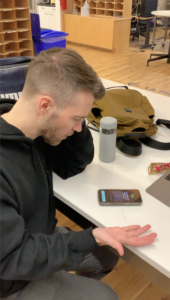
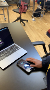
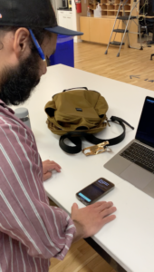
The main thing I learned from the user testing was that there was a need to show people how to unsubscribe from their unwanted junk mail, so I added the tutorial after connecting the planter to guide users on how unsubscribe from a typical marketing email. Another thing I learned was that users were most likely not going to read the text on the app, so I minimized the amount of text there was on each screen. And lastly, there was feedback on equating the statistics to something relatable, for instance, comparing the amount of CO2 emitted from your inbox to miles while driving, so that people can get a better idea of their carbon footprint.