Project
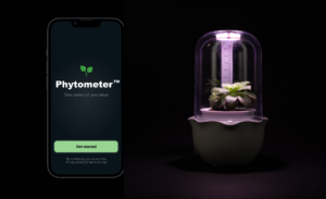
The Phytometer is a product that you can put on your desk that helps to maintain your inbox and offset your carbon footprint. The Phytometer Planter connected to your inbox, and when you receive junk mail, the UV light that keeps the plant alive is turned off. The only way to turn the light back on is to unsubscribe from the newsletters that are flooding your inbox. The main intention of the project is to encourage people to unsubscribe to the unwanted emails in their inbox. It isn’t enough to just delete them, we should unsubscribe from the lists to make sure they’re never sent. It is intended to be ironic and sarcastic, since corporations should not being sending so many email regularly. It is also looking at corporations critically who put the onus on individuals for the cause of climate change, when the biggest carbon footprint are caused by large corporations and out of our control.
Link to the Figma prototype
I-A-E
Ideas
- Climate change is bad
- Everyone should try to reduce their carbon footprint
Arrangements
- Hard arrangement: people are required to use their computers/email for work and life
- Soft arrangement: businesses target customers using a “free” and quick tool — email
Effects
- People think sending emails are free of physical repercussions
- People receive lots of emails a day that they ignore
- People are unaware of the things done behind-the-scenes to send/receive email
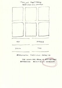
Systems Maps
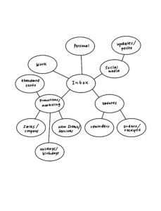
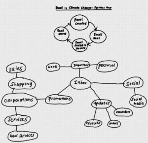
These systems maps are to look at the types of emails sent to our inboxes, and determining what are essential and what are not. This was the basis of the project, which helped me to determine that marketing emails are the most prominent type of email in my inbox, and the ones I ignore the most.
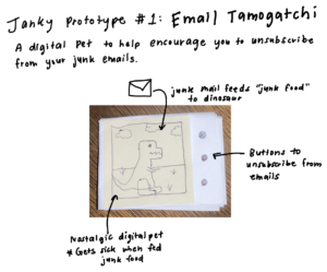
Janky Prototypes

Interview
I interviewed my colleague, Aneesha Desai, who is a climate activist and engineer.
Q: Can you give us a quick description about who you are and the work you do?
A: I’m Aneesha, and currently I work on a team at Google that does research on climate change. We analyzes data to see where products source their materials from, and help companies to use the data to figure out how to reduce their carbon footprint. I also created an app called Planet Possible, which educates people on climate change and encourages them to take action.
Q: Can you tell us how you initially became interested in working on climate change?
A: A few years ago, I initially became conscious of my non-environment friendly habits, and started to try and offset my carbon footprint by changing my daily habits, like becoming vegan. It wasn’t until the wildfires in Australia in 2020 which made me realize that I wanted to make a bigger impact and decided to join my team at Google.
Q: What are your thoughts on the general public and their idea of climate change?
A: Typically, I see people react in three different ways. The first group are hardcore climate activists, and are very passionate and knowledgable about climate change. The second group are climate change deniers, who don’t believe climate change will impact their lives. And lastly and more commonly, I see people who are aware of climate change, but don’t know where to start making an impact. We found that about 85% of the people make up the last group. Many people care about the problem and want to take action, but lack knowledge about the topic and can’t find ways to participate in the cause. This is what led me to build my app Planet Possible, which educates people on all the industries that contribute to climate change, and gives them ways to reach out to key people to enact change.
Q: What do you think is the most effective way to motivate people to change?
A: Through building Plant Possible, we’ve found that people are most inclined to participate in a rewards-based system, where they are given rewards for their actions. We found that just providing facts and statistics on your carbon footprint does not enact change, and people need more to be motivated to change. This is why we’re pivoting the Planet Possible app to a more rewards-based platform, where people attain points when they offset their carbon footprint.
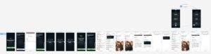
UX Docs
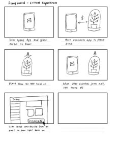
The storyboard of the intended flow the Phytometer product.
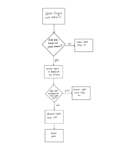
The user flow diagram of the Phytometer app.
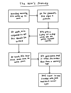
A user journey diagram for the intended audience.
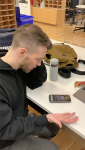
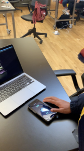
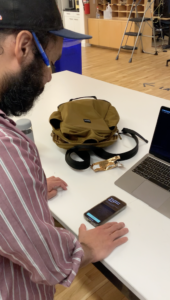
User Testing
User Testing 1 video
User Testing 2 video
User Testing 3 video
The main thing I learned from the user testing was that there was a need to show people how to unsubscribe from their unwanted junk mail, so I added the tutorial after connecting the planter to guide users on how unsubscribe from a typical marketing email. Another thing I learned was that users were most likely not going to read the text on the app, so I minimized the amount of text there was on each screen. And lastly, there was feedback on equating the statistics to something relatable, for instance, comparing the amount of CO2 emitted from your inbox to miles while driving, so that people can get a better idea of their carbon footprint.
Rubric/Goal Assessing
Totally fulfilled: My project becomes real, and helps many people reduce their junk mail.
Somewhat fulfilled: People remember the presentation when looking at their inbox and are more conscious about what emails are sent to them.
Not fulfilled at all: My intended audience do not believe their inbox makes an impact on climate change.
How might you measure the success of your fully realized project?
I would measure the success of my fully realized project by comparing inbox sizes before and after using the product over a long period of time.
What are some “key performance indicators”? Indulge your wildest dreams!
In 2 years, corporations are banned from automatically subscribing users to newsletters. They are also required to make the process to unsubscribe more obvious.
Bibliography
Armstrong, Martin, and Felix Richter. “Infographic: The Carbon Footprint of ‘Thank You’ Emails.” Statista Infographics, 4 Dec. 2019, https://www.statista.com/chart/20189/the-carbon-footprint-of-thank-you-emails/.
Dirty Messages: The Unseen Carbon Footprint of Communication. https://www.researchgate.net/publication/358277360_DIRTY_MESSAGES_The_Unseen_Carbon_Footprint_of_Communication.
“’Think before You Thank’.” ‘Think Before You Thank’ | OVO Energy, https://www.ovoenergy.com/ovo-newsroom/press-releases/2019/november/think-before-you-thank-if-every-brit-sent-one-less-thank-you-email-a-day-we-would-save-16433-tonnes-of-carbon-a-year-the-same-as-81152-flights-to-madrid.
“Why Your Internet Habits Are Not as Clean as You Think.” BBC Future, BBC, https://www.bbc.com/future/article/20200305-why-your-internet-habits-are-not-as-clean-as-you-think.
S. D. U. Mageswari, P. Suganthi and M. Meena, “Carbon Footprint of Information and Communication Technologies,” 2022 International Conference on Edge Computing and Applications (ICECAA), 2022, pp. 338-342, doi: 10.1109/ICECAA55415.2022.9936485.