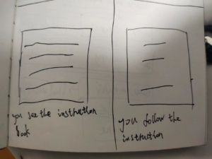
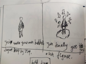
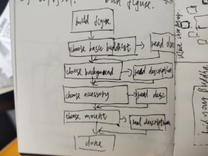
Skip to content

Topic 2 User Tests

Topic 2 User Test

I sent my project to some of my friends, they helped me to gain more feedback on my ideas:


  • They told me that it was an interesting concept
  • The layout is simple and could use more colors
  • I should add information about the tools for the “ancient Native American” weapons.

After doing this I was told that I should also:

  • Maybe add a gif to make it more engaging.
  • Make the buttons look more like a button instead of plain white


Guide 2 User Tests

Storyboarding:

User flow diagram:

User Journey:

Persona: A young people who are interested in fashion, art or any new stuffs. Also, he/she has limited knowledge about Buddhism.

You are boring and casually browse social media on Instagram or WeChat. You see some friends who post various buddhist figures that are not classical but have many modern elements on them. There are a link on their posts’ comment area. You feel curious so you click the link. After that, you open a website which demonstrates a lot of fashion style buddhist figures. The description of the website tells you that you can DIY your own buddhist figures. You feel excited because you like the fusion of cool parts with classical buddhist elements. The buddhist figure will make you feel distinct and creative. You immediately follow the steps on the website. All the buddhist figures and parts have the description of their meaning. They pray for health, wealth, goodness, and etc. First, you choose the blank buddhist figure based on your birthday. Second, you choose the background of the buddhist figures. Third, you choose the clothes. Fourth, you choose the head and wrist accessories. Finally, you get the NFT image of your buddhist figure. You can buy the image or order a 3d printed model of the figures on website. After you finish your DIY, You see the history and background of them; also, you learn and know the knowledge of Buddhism. The process of buddhist figure’s DIY is also a course for people who are not familiar with Buddhism. You feel the website is so cool and it is a good start for younger generation to know the conventional Buddhism concept; therefore you also post your buddhist figure with the website link on social media.  

I narrated the user journey to one of my friend and my brother who are taking the art doctor degree in Japan. I asked them couple question.

Did you find any aspects of this confusing?

They feel confused about the guide’s intention. 

How would you feel experiencing this work?

Limited space for user to create. The contents are too serious and it didn’t resonate with user.

Which aspects would you most need to see or try to understand this work?

Everything is clear. But the 3d models part are hard to made. It can be replaced by collage. 

Did you learn or interest in anything from this work?

The form of DIY is creative. 

Are there ways I might adjust this to better meet my goal?

Give users more creative space. Don’t limit user on the natal buddhist figures.

User Tests for Topic 2

I had a few friends user-test my site. There initial insights were:

-The postcard doesn’t look good/bad color choice

-The site layout was confusing

-Not enough information or reason to care

-No hook for the site

I adjusted the postcards and made changes to the site layout to address some of those issues. Their second round of feedback was:

-Postcard is much better! Need more

-Layout is better but could still use work on colors, font, and feeling

-Still needs more information about fracking 

I added a landing page style popup to try to address their feedback, add a hook, and supply more information. I still think more information links are needed to complete the site, but don’t have enough time at the moment to add them.

Topic 2 User Tests

User Testing 1 video

User Testing 2 video

User Testing 3 video 

The main thing I learned from the user testing was that there was a need to show people how to unsubscribe from their unwanted junk mail, so I added the tutorial after connecting the planter to guide users on how unsubscribe from a typical marketing email. Another thing I learned was that users were most likely not going to read the text on the app, so I minimized the amount of text there was on each screen. And lastly, there was feedback on equating the statistics to something relatable, for instance, comparing the amount of CO2 emitted from your inbox to miles while driving, so that people can get a better idea of their carbon footprint.

Topic 2: User Tests

I tested with two friends (the same ones I interviewed). There feedback was great, but since I had to switch from the dictionary to the dice it was ultimately not as useful.

This was my first iteration of the dictionary:

They both agreed that it was not intuitive. One said that the interface was overwhelming since there were so many emoji symbols. They are weren’t sure what the purpose of the site was.

This was my second iteration of the dictionary:

One said that it looked a bit boring, and they wouldn’t use it. The other said that it should be and feel more than just a directory. They suggested making it more urban dictionary-esque and allowing people to add their own emoji definitions since it would help to see not only the intended definition but also the way people actually use it.

Project II: User Tests

User test: I chose 2 people in my family to go through my mini-book. User one is a 65-year-old female. User Two is a 36-year-old male. User Three is a 19-year-old female, and User four is a 21-year-old male.

User 1: I like how it looks, but the letters were too small and were a little bit hard to read, how about making it bigger? Also, I have the way you rank the information, reasonably.

Use 2: I like the format you made, but I am confused why you them half in colored, and left half in black and white. I have color recognition trouble, I rather you make it all in black and white.

User 3: I don’t like the pictures you made in the book, they are too heavy. But the direction you made for negotiation I think it is very helpful, especially for Asian parents.

User 4: I like it because it is beautiful and very easy to hand out. But I can’t read English, can you make a Korean vision?

Topic 2: User Testing

  • by

I tested with three different people, one is a classmate, another is my friend, and another is my older sister.

My project involve using third-party applications for live polling results. I’ve tested several applications, and make final decisions on which one to use based on user experiences feedback. I’ve tested apps like Slido, RateCX, Google Form, QRThumbs, and many more.


Some users told me my original poll questions are too aggressive, making them scared of answering, thinking it might be a judgmental question.

I went in and revise the questions, and in the second version, there are some feedback of sentences being unclear or too clear, I continued to work on making the questions better. Better in the sense that making participants feel comfortable answering while also staying engaged.

I also have feedback about the poll questions not feeling personal enough, lack an interest in truly engaging, so I made some of the questions into scenario questions for people to imagine.