Letter”forms”
Georgia Chen
Advisor: Kari Love
A visual exploration of modular rhythm and spatial structure in Chinese characters
Project Description
Letterform Architectures “Zi Zhu” is a visual exploration of the hidden compositional patterns within Chinese characters. It examines how each letterform holds not only meaning, but an internal scaffolding—a logic of strokes, direction, and balance that is often overlooked in the act of reading.
By deconstructing, extracting, and reassembling characters through geometric forms, this project shifts focus away from linguistic meaning and toward structure. Utilizing the modularity and rhythmic patterns of Chinese letterforms, the process of writing is now reimagined as a spatial unit. Meaning becomes a blueprint while letters become diagrams of motion and weight.
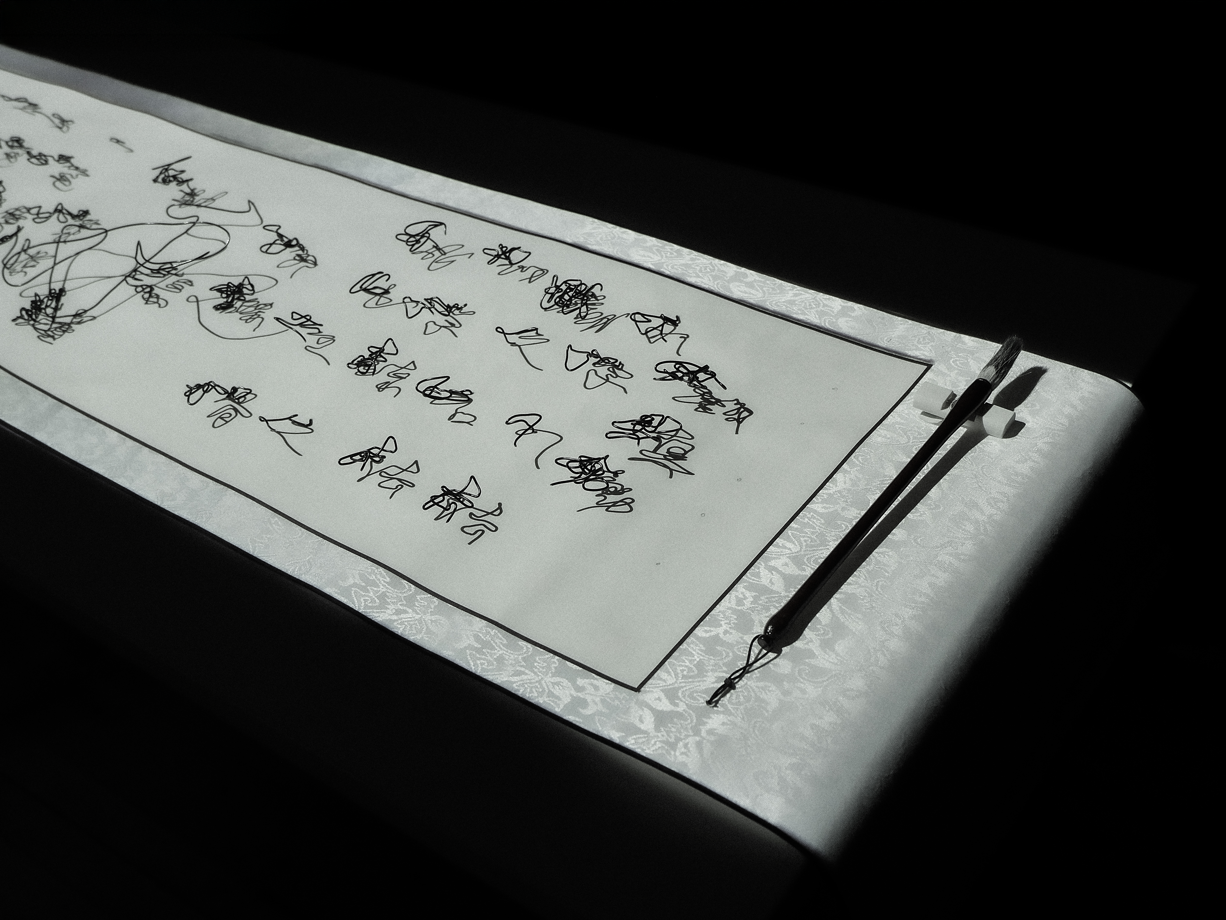
The goal is to expand how written language can be experienced—visually, structurally, and intuitively. The final installation is executed as a scroll of decoded character constructions that allows audience to explore and visualize the process of writing.
Technical Details
Letterform structures utilized the MakeMeHanzi open-source dataset to extract the median stroke coordinates of Chinese characters. These .json coordinates files are processed using Python and visualized as three-dimensional stroke path structures in Blender.
The physical sculpture was constructed using aluminum wire 1:1 to the digital models. Projection content are rendered in blender and AfterEffects and mapped using Madmapper.
Research/Context
This exploration emerges from my ongoing interest in Chinese visual systems and typographic structure. Inspired by "The Ten Thousand Things"by Lothar Ledderose, I began to examine how Chinese art and design—ranging from characters to architecture—have long operated through modular logic and spatial repetition.
Through my recent engagement with calligraphic forms, I started to view Chinese characters not as carriers of meaning, but as structured visual compositions — shaped by rhythm, balance, and constraint. Writing became less about communication, and more about **the choreography of form.
This project began as a quiet act of resistance against typographic rigidity, challenging the invisible grid that governs how characters are constructed and read. What followed was a series of generative experiments — scripting, modelling, sculpting — that allowed me to re-encounter the characters I’ve known my whole life, not through meaning, but through space, motion, and structure.
Lastly, a huge gratitude to all family and friends. Special thanks to my grandfathers, whose quiet brilliance in circuits and woodwork lives on in my heart and hands—may my explorations at ITP carry forward their spirit of curiosity.