Lydia Jessup
In a world of “big data,” what story will you choose to tell when you have the controls?
https://lydiapjessup.tumblr.com/tagged/icm2018
Description
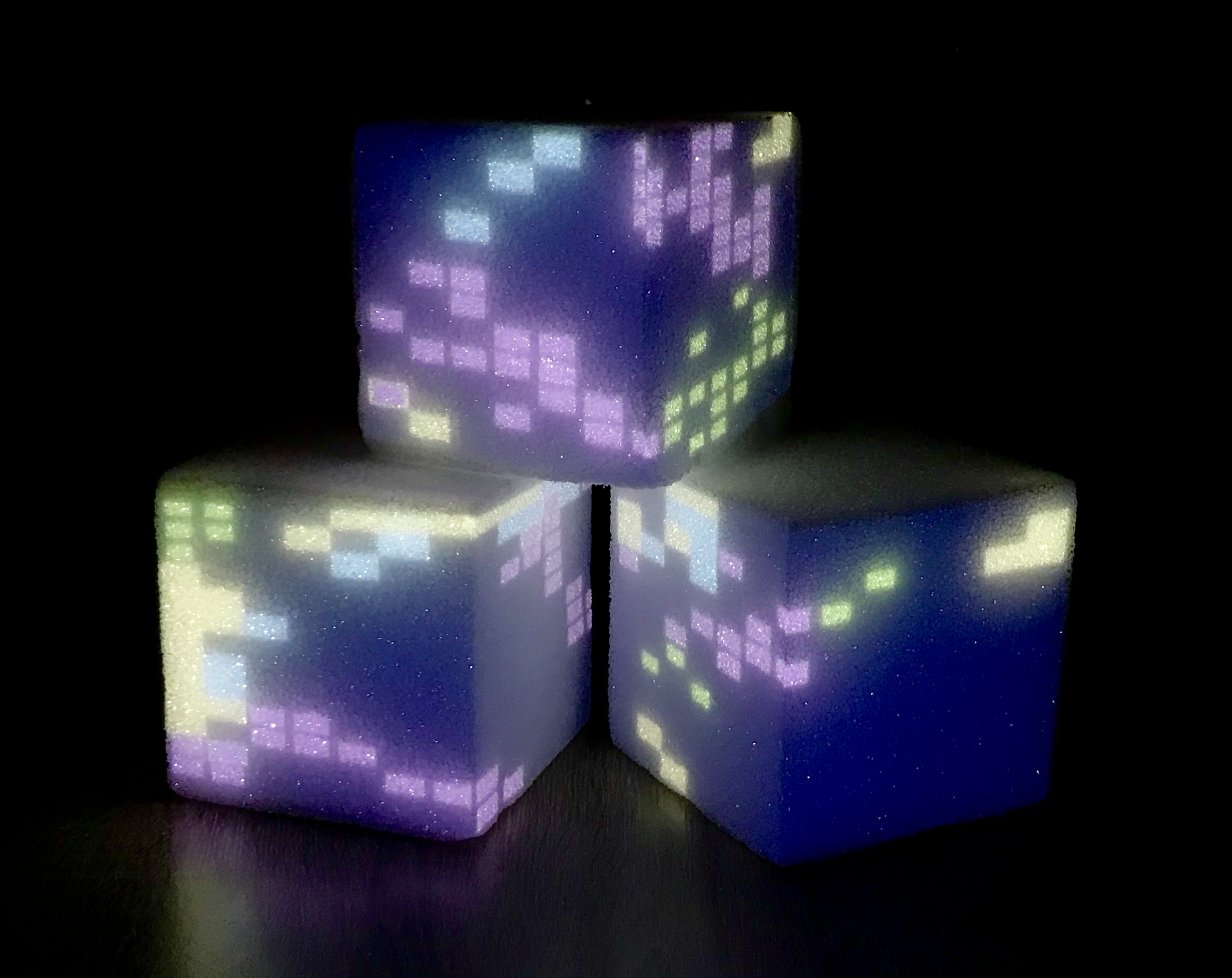
This piece invites viewers to control data visualizations on 5in x 5in cubes representing different neighborhoods in Chicago. The viewer sees shapes, colors and patterns appear on the cubes as they move the controls and can see how neighborhoods differ from one another through these abstract representations of the data. Pulled from the Chicago Data Portal from domains such as health, the economy, education and the environment, these data tell a story – and the viewer gets to decide what that story is. In an era of “big data,” this piece invites viewers to question the multiple filters and curation that data go through in collection, analysis and presentation and how this determines the narrative we choose to tell about places and the people who live there.
This piece is an exploration of different ways of viewing and interacting with data beyond screen-based and more literal data visualizations. The viewer has a control panel with sliders that control the size or “weight” of each data type. The control panel will also have instructions for how to use it and an explanation of the type of data displayed. The color scheme is taken from data analysis software editors as a reference to the piece giving people without a coding background the ability to manipulate data. The neighborhoods will not be labeled to allow the viewer to abstract the visualizations and imagine the city or neighborhood where they live or where they are from.
Classes
Introduction to Computational Media